We use models to understand and predict relationships.
Example questions:
Does oil wealth impact regime type? (causal question)
Where is violence likely during an election? (prediction)
Is this email spam? (classification)
Each requires data and a model, but the goal (causal vs predictive vs categorical) determines how we evaluate it.
Model
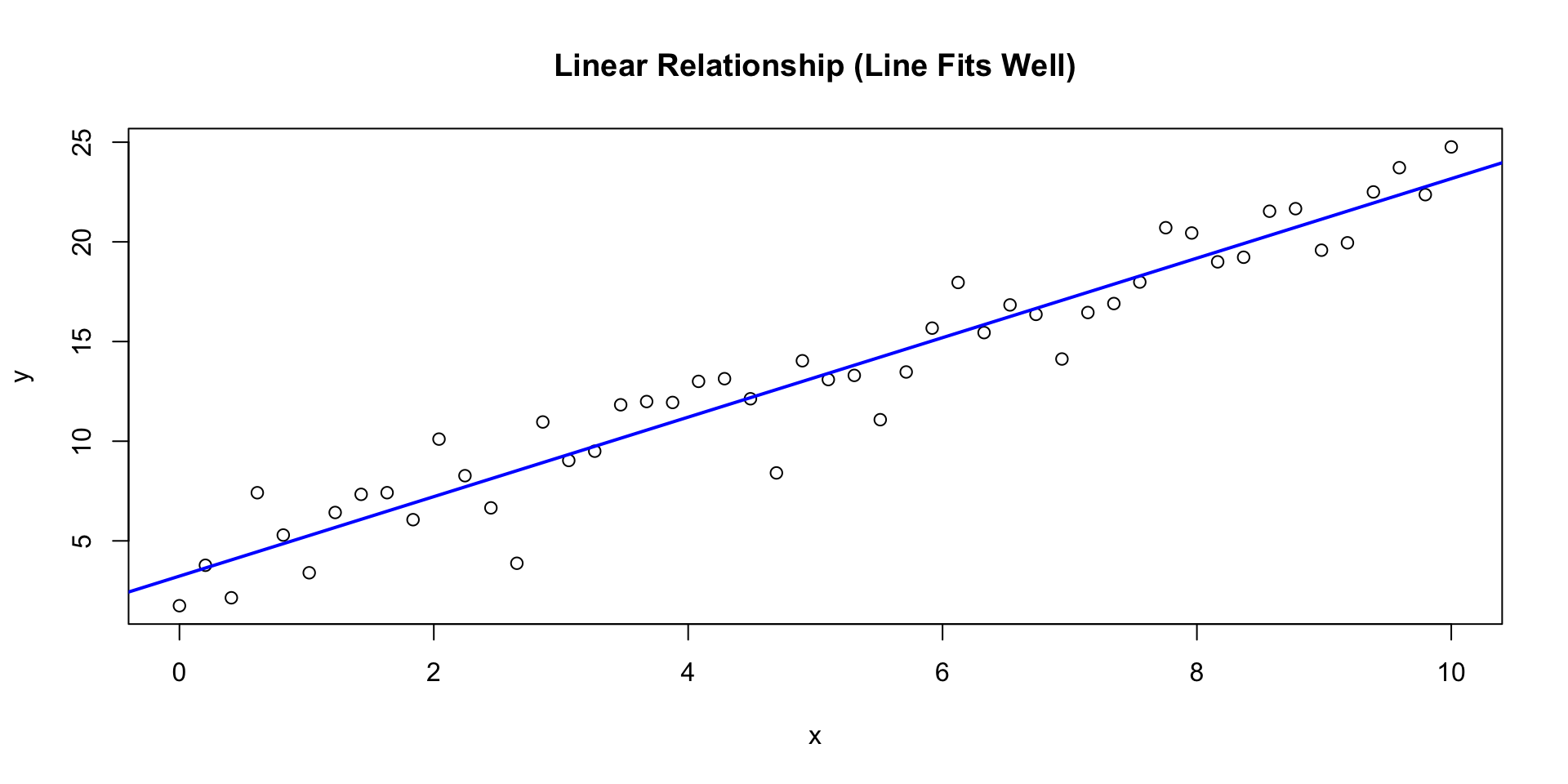
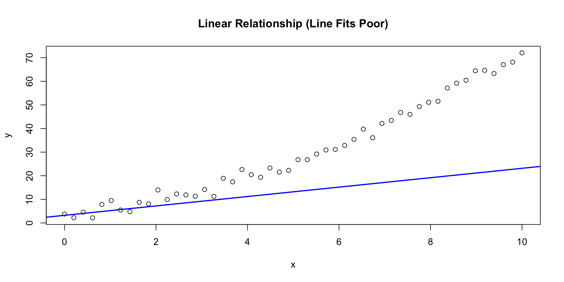
A model is a simplified mathematical description of a relationship.
\[\widehat{y} = b_0 + b_1 x\]
\((b_1)\): change in \(( \widehat{y} )\) for a 1‑unit change in \((x)\)
\((b_0)\): predicted value when \((x=0)\)
A simple one-dimensional linear model.
Supervised Learning
We’re given data with
inputs: \(X\)
outputs: \(Y\)
We learn a mapping:
\[f:\; X \rightarrow Y\]
We use this to make a prediction of \(Y\) given \(X\).
Understanding Variables
Response (target, outcome, \(Y\)) — what we want to explain or predict
Explanatory (predictor, feature, \(X\)) — what we use to explain \(Y\)
Two common tasks
Regression:\(Y\) is continuous (e.g., income, temperature)
Classification:\(Y\) is categorical (e.g., f/m, fraud/not)
X can be numeric or categorical. If it’s categorical, R internally creates dummy variables for each category.
Today’s focus: linear regression with one predictor (a straight line).
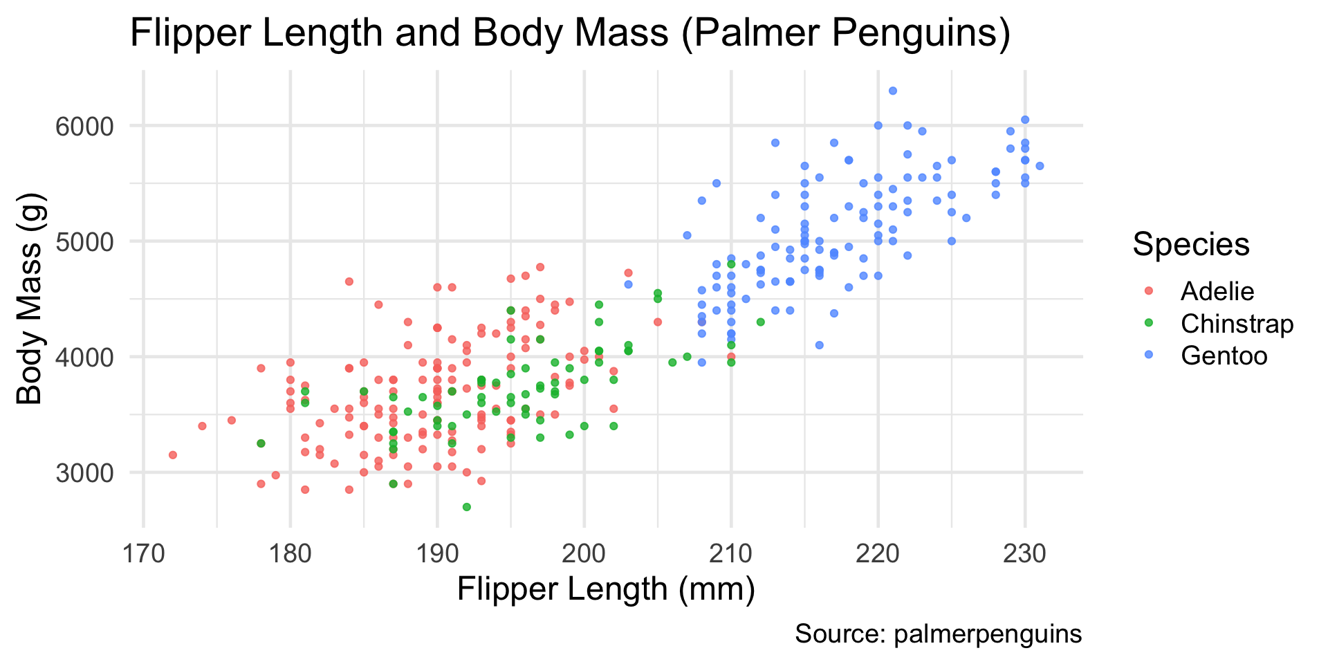
Example Dataset: Palmer Penguins
library(tidyverse)library(palmerpenguins)# Keep rows with the two variables we needmodel_data <- penguins |>filter(!is.na(flipper_length_mm), !is.na(body_mass_g)) |>select(species, flipper_length_mm, body_mass_g)glimpse(model_data)
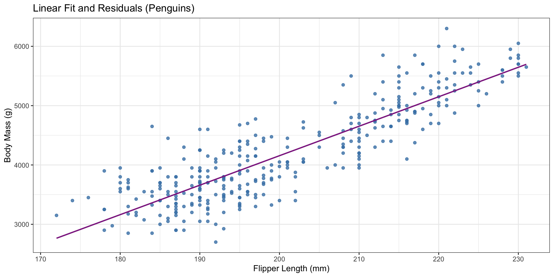
Intercept (\(b_0 = -5780\)):
The predicted body mass when flipper length = 0 mm.
This is not meaningful for penguins (no penguin has a 0 mm flipper),
but it’s mathematically required to define the line.
Slope (\(b_1 = 50\)):
For each 1 mm increase in flipper length,
the model predicts an average increase of about 50 g in body mass.
In context:
A penguin with a flipper that is 10 mm longer is predicted to weigh roughly 500 g more, on average.
Predictions are for average trends, not individual birds. Real data always has variability around the line.
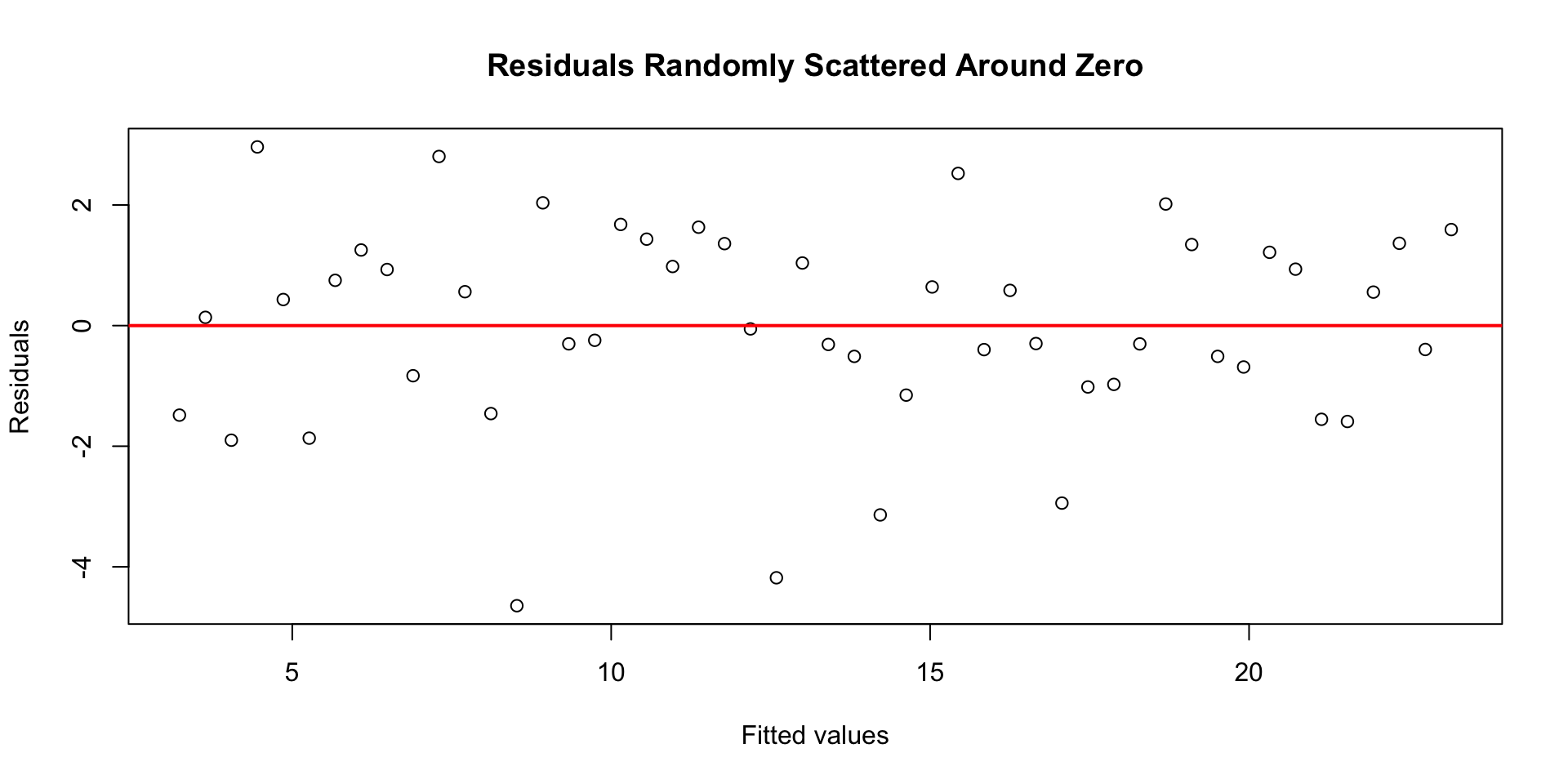
Predictions and Residuals
Predicted values: \(\widehat{y} = b_0 + b_1 x\)
Residuals: \(y - \widehat{y}\)
Penguins above the line have positive residuals (heavier than predicted); those below have negative residuals.
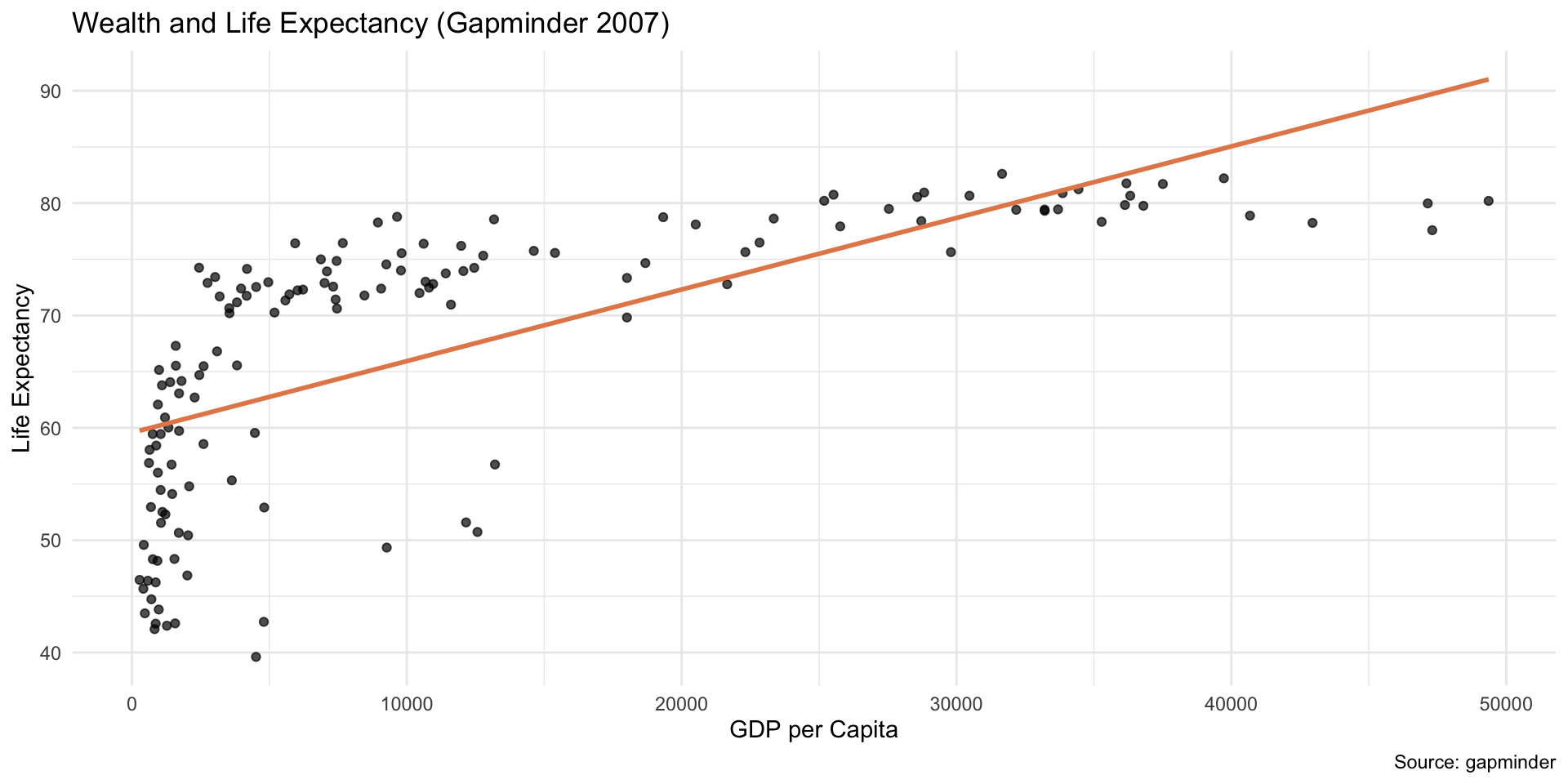
ggplot(gm, aes(x = gdpPercap, y = lifeExp)) +geom_point(alpha =0.7) +geom_smooth(method ="lm", color ="#E48957", se =FALSE) +labs(title ="Wealth and Life Expectancy (Gapminder 2007)",x ="GDP per Capita",y ="Life Expectancy",caption ="Source: gapminder" ) +theme_minimal()
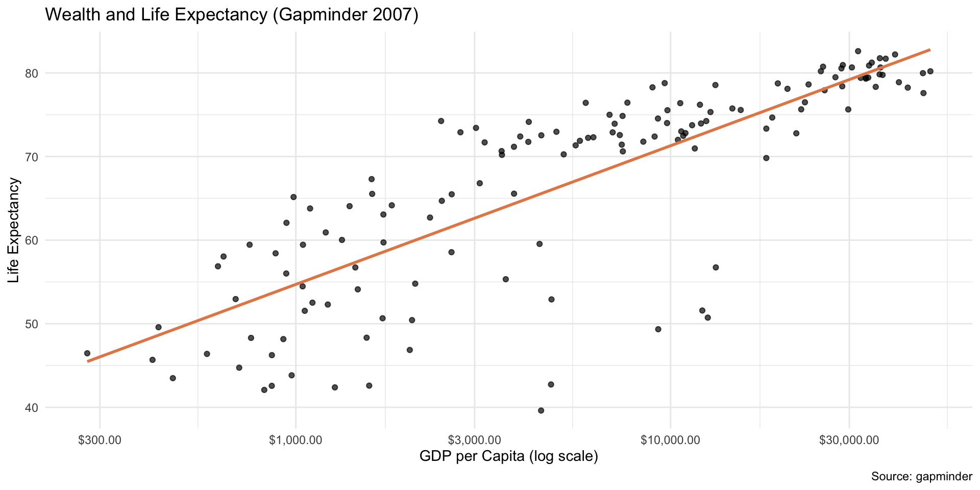
Log‑X Example with Gapminder
Log scale in x
Code
ggplot(gm, aes(x = gdpPercap, y = lifeExp)) +geom_point(alpha =0.7) +geom_smooth(method ="lm", color ="#E48957", se =FALSE) +scale_x_log10(labels = scales::label_dollar()) +labs(title ="Wealth and Life Expectancy (Gapminder 2007)",x ="GDP per Capita (log scale)",y ="Life Expectancy",caption ="Source: gapminder" ) +theme_minimal()
Log‑X Example with Gapminder
gm_model <-lm(lifeExp ~ gdpPercap, data = gm)summary(gm_model)$r.squared
[1] 0.4605827
# take log(x)gm_model <-lm(lifeExp ~log(gdpPercap), data = gm)summary(gm_model)$r.squared
[1] 0.654449
Log‑X Example with Gapminder
When the explanatory variable is logged, interpret the slope using multipliers.
For a percent change in GDP per capita, multiply the slope by \(\log(\text{multiplier})\).