Grammar of Graphics
Sarah Cassie Burnett
September 9, 2025
Types of Visualizations
- Column charts (bar charts)
- Use to compare values across categories
- Histograms
- Use to show distribution of a single variable
- Line charts
- Use to show trends over time
- Can use column charts but not as effective
- Scatter plots
- Use to show relationships between two variables
- X-axis is usually explanatory variable, Y-axis is outcome variable
The Grammar of Graphics
- Data viz has a language with its own grammar
- Basic components include:
- Data we are trying to visualize
- Aesthetics (dimensions)
- Geom (e.g. bar, line, scatter plot)
- Color scales
- Themes
- Annotations
Let’s start with the first two, the data and the aesthetic, with a column chart example…
This gives us the axes without any visualization:
Now let’s add a geom. In this case we want a column chart so we add geom_col().
That gets the idea across but looks a little depressing, so…
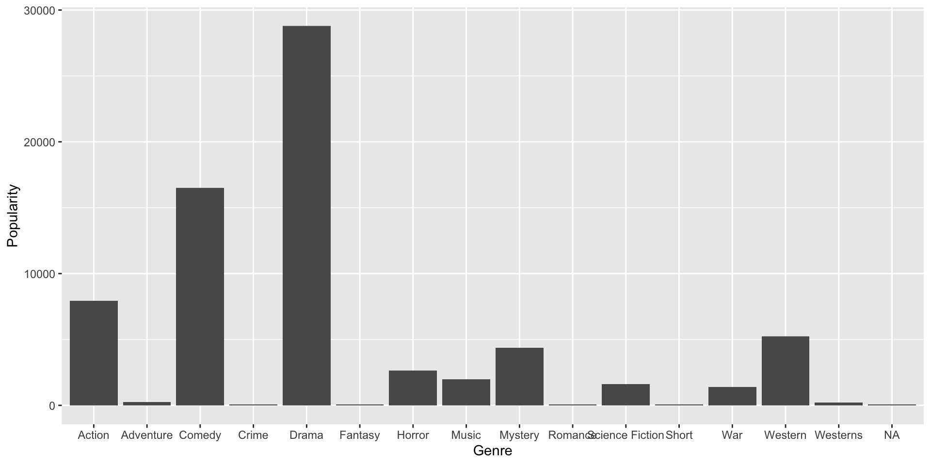
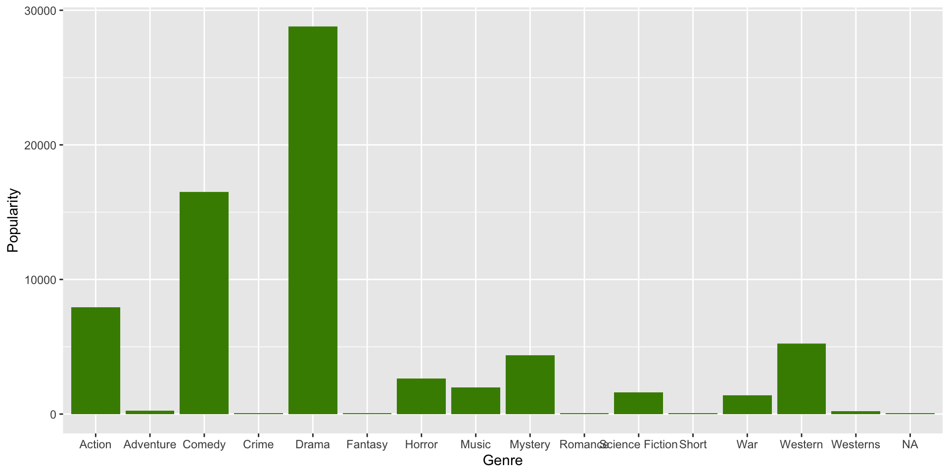
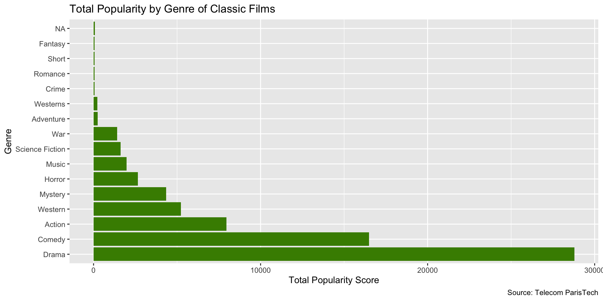
…let’s change the color of the columns by specifying fill = "chartreuse4".
Tip
See here for more available ggplot2 colors.
Note how color of original columns is simply overwritten:
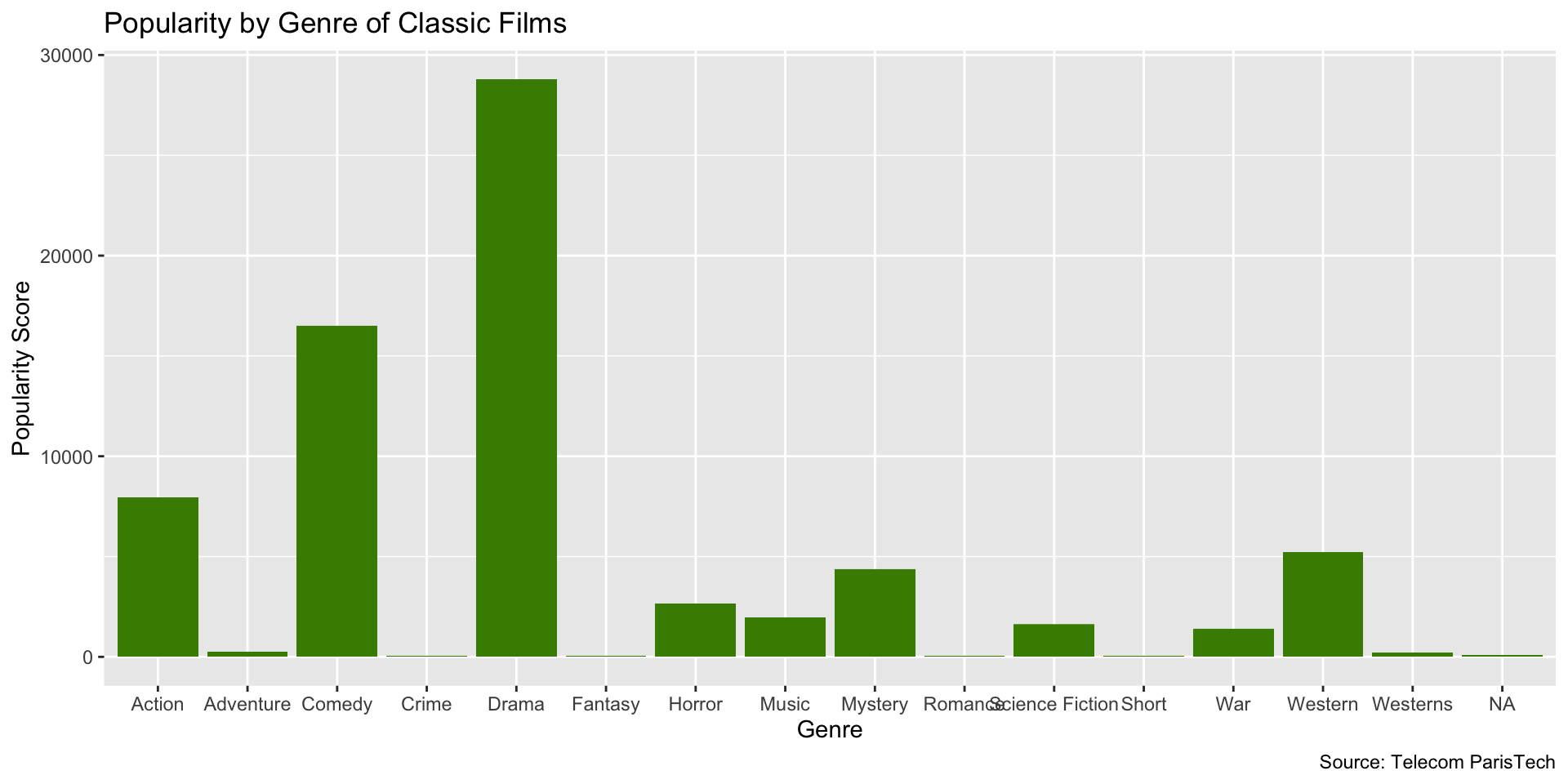
Now let’s add some labels with the labs() function:
And that gives us…
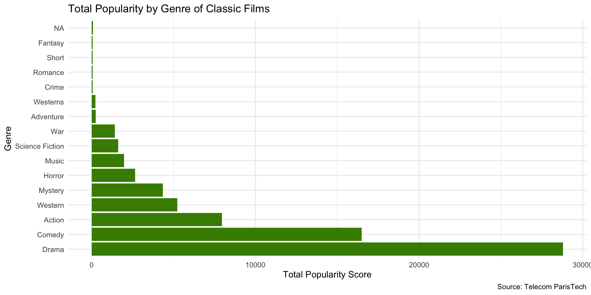
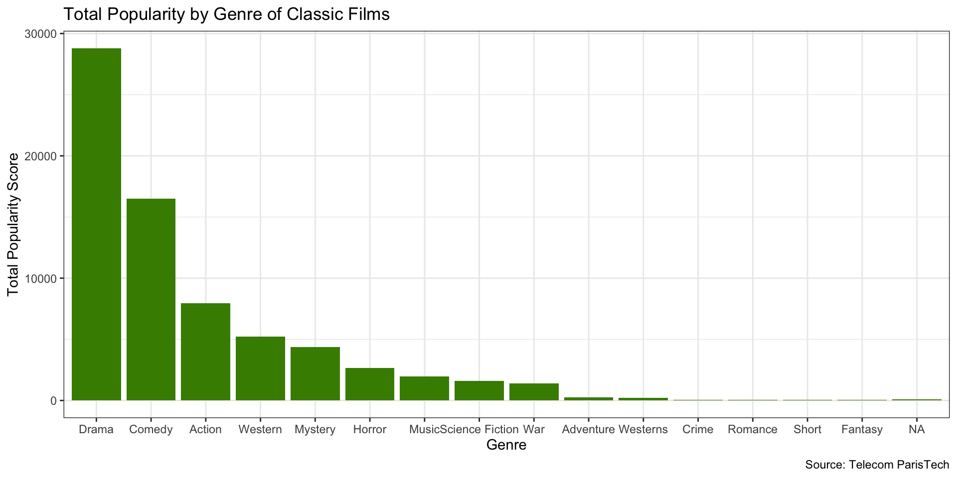
Next, we reorder the bars with fct_reorder() from the forcats package. But before that, we summarize the Popularity scores.
library(dplyr)
library(ggplot2)
library(forcats)

films_summary <- films %>%
  group_by(Genre) %>%
  summarise(Popularity = sum(Popularity, na.rm = TRUE)) %>%
  ungroup()

ggplot(films_summary, aes(x = fct_reorder(Genre, -Popularity), y = Popularity)) +
  geom_col(fill = "chartreuse4") +
  labs(
    x = "Genre",
    y = "Total Popularity Score",
    title = "Total Popularity by Genre of Classic Films",
    caption = "Source: Telecom ParisTech"
  ) +
  coord_flip()
Note that we could also use the base R reorder() function here.
This way, we get a nice, visually appealing ordering of the bars according to levels of popularity…
We can also flip the coordinates.
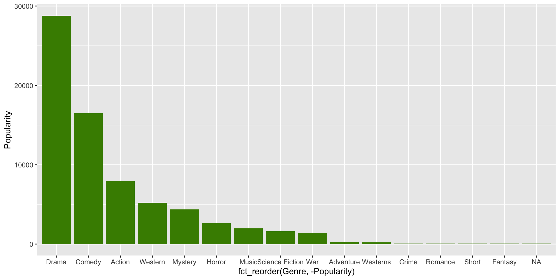
Now let’s change the theme to theme_minimal().
Tip
See here for available ggplot2 themes.
Gives us a clean, elegant look.
Note that you can also save your plot as an object to modify later.
Which gives us…
Now let’s add back our labels…
So now we have…
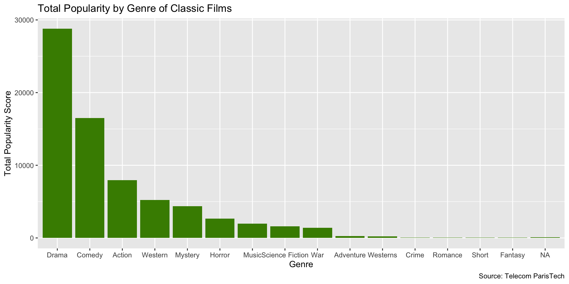
And now we’ll add back our theme…
et Voila!

Change the theme. There are many themes to choose from.
Try it out!
glimpse()the data- Find a new variable to visualize
- Make a bar chart with it
- Change the color of the bars
- Order the bars
- Add labels
- Add a theme
- Try saving your plot as an object
- Then change the labels and/or theme
10:00
Histograms
Purpose of Histograms
- Histograms are used to visualize the distribution of a single variable
- x-axis represents value of variable of interest
- y-axis represents the frequency of that value
Purpose of Histograms
- They are generally used for continuous variables (e.g., income, age, etc.)
- A continuous variable is one that can take on any value within a range (e.g., 0.5, 1.2, 3.7, etc.)
- A discrete variable is one that can only take on certain values (e.g., 1, 2, 3, etc.)
- Typically, the height of the bar represents the number of observations which fall in that bin
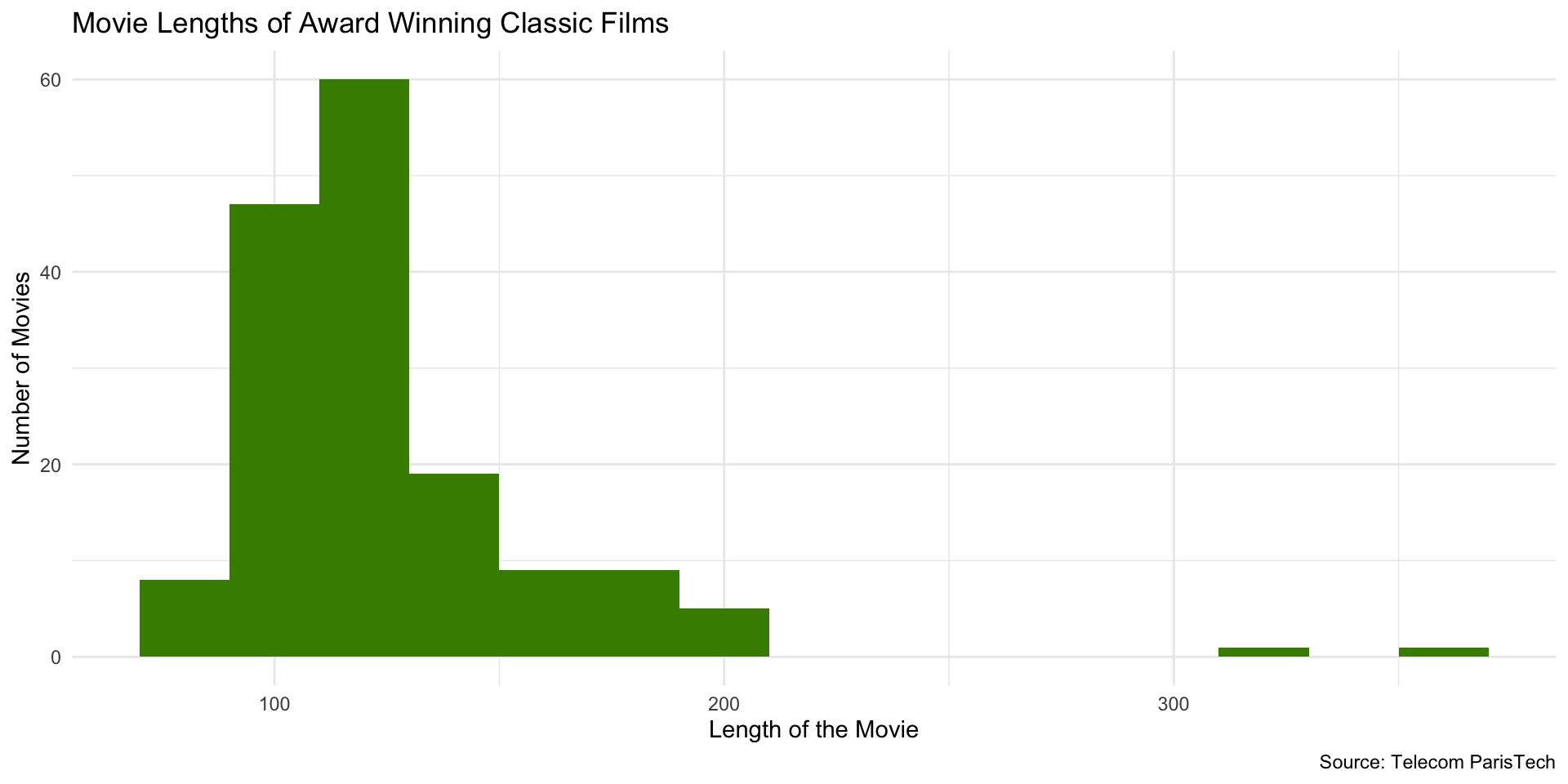
Example
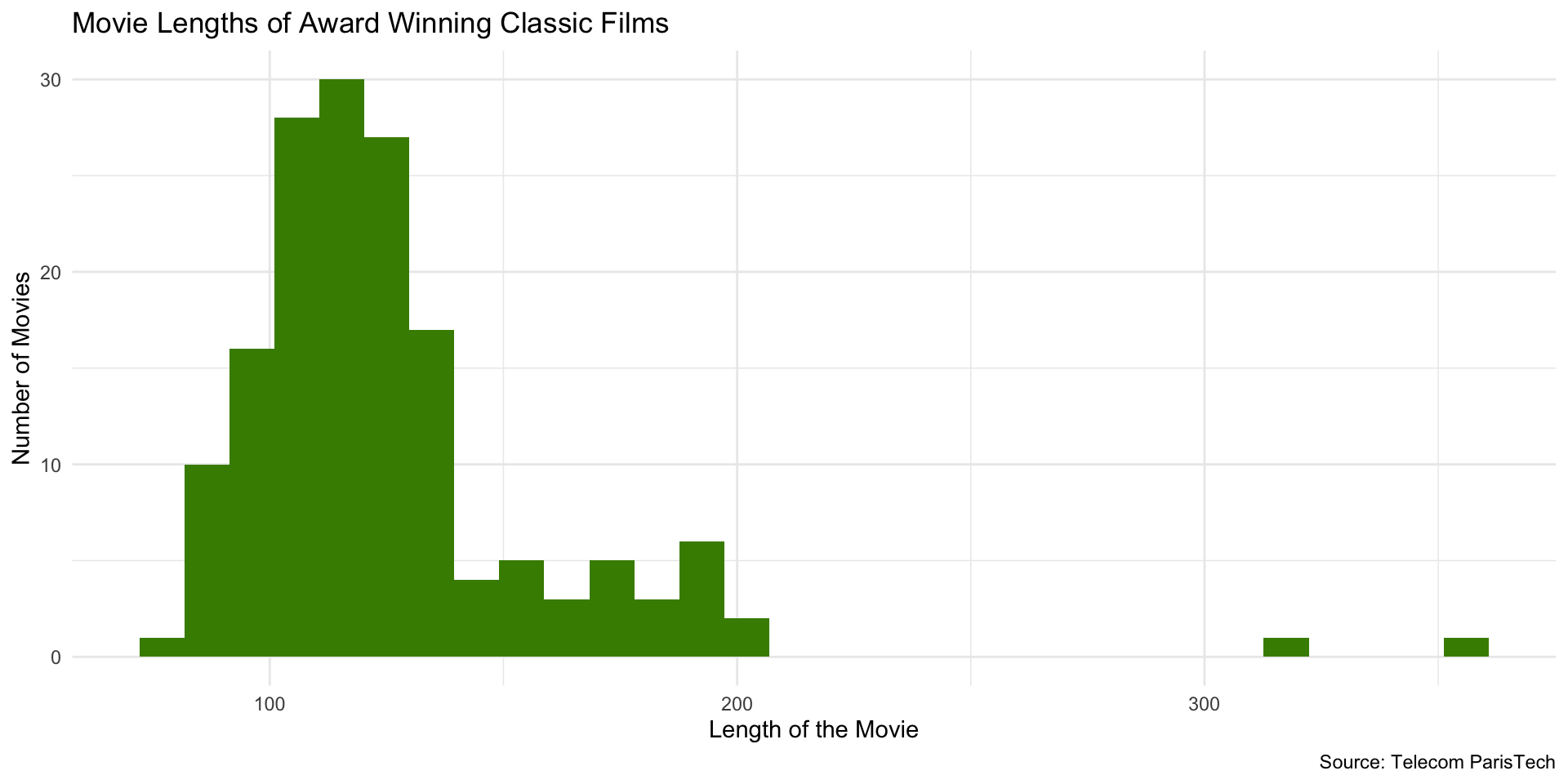
Histogram Code
# load dplyr
library(dplyr)

# load data
films <- read_csv("data/film_cleanish.csv")

# filter for the films with awards
films_w_awards <- films |>
  filter(Awards)

# create histogram
ggplot(films_w_awards, aes(x = Length)) +
  geom_histogram(fill = "chartreuse4") +
  labs(
    x = "Length of the Movie",
    y = "Number of Movies",
    title = "Movie Lengths of Award Winning Classic Films",
    caption = "Source: Telecom ParisTech"
  ) + theme_minimal()
Histogram Code
Note that you only need to specify the x-axis variable in the aes() function. ggplot2 will automatically visualize the y-axis for a histogram.
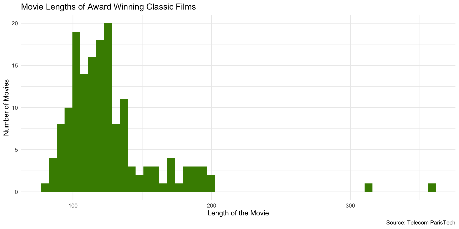
Change Number of Bins
Change number of bins (bars) using bins or binwidth arguments (default number of bins = 30):
At 50 bins…
At 100 bins…probably too many!
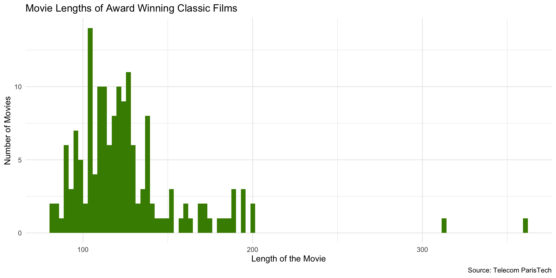
Using binwidth instead of bins…
Setting binwidth to 2…
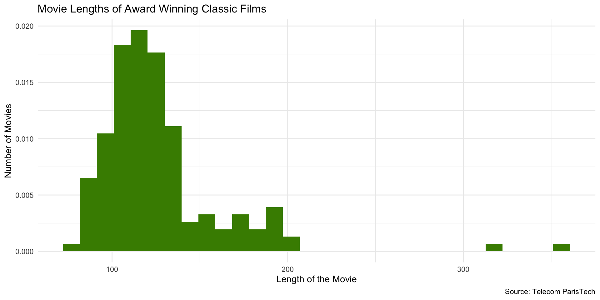
Change from Count to Density
For densities, the total area sums to 1. The height of a bar represents the probability of observations in that bin (rather than the number of observations).
Which gives us…
Try it out!
- Pick a variable that you want to explore the distribution of
- Make a histogram
- Only specify
x =inaes() - Specify geom as
geom_histogram
- Only specify
- Choose color for bars
- Choose appropriate labels
- Change number of bins
- Change from count to density
10:00