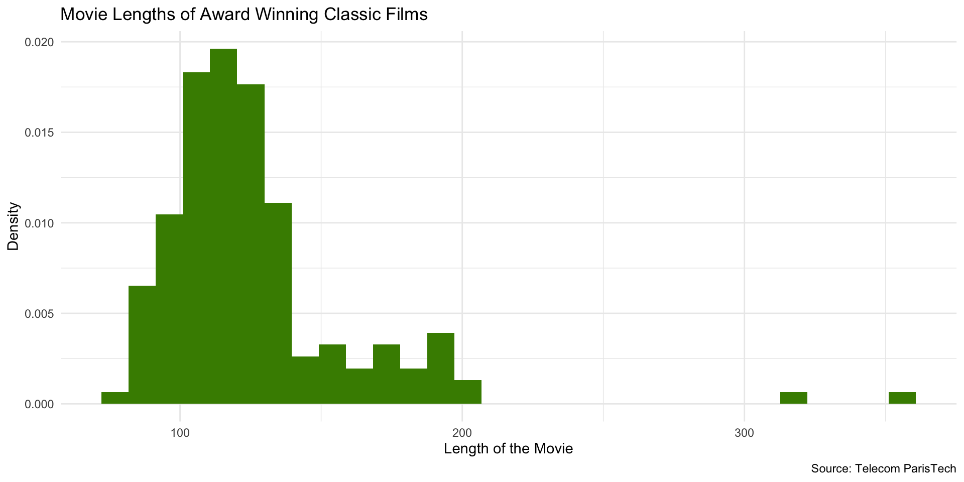
library(readr)
library(dplyr)
library(ggplot2)

# load data
films <- read_csv("data/film_cleanish.csv")

# filter for the films with awards
films_w_awards <- films |>
  filter(Awards)

# create histogram
ggplot(films_w_awards, aes(x = Length)) +
  geom_histogram(fill = "chartreuse4") +
  labs(
    x = "Length of the Movie",
    y = "Number of Movies",
    title = "Movie Lengths of Award Winning Classic Films",
    caption = "Source: Telecom ParisTech"
) + theme_minimal()Data Visualization Techniques
Sarah Cassie Burnett
September 11, 2025
Histograms
Purpose of Histograms
- A histogram shows the distribution of a single numeric variable.
- The x-axis represents the values of the variable, divided into bins (intervals).
- The y-axis represents the frequency (or count) of observations in each bin.
Purpose of Histograms
- They are generally used for continuous variables (e.g., income, age, etc.)
- A continuous variable is one that can take on any value within a range (e.g., 0.5, 1.2, 3.7, etc.)
- A discrete variable is one that can only take on certain values (e.g., 1, 2, 3, etc.)
- Typically, the height of the bar represents the number of observations which fall in that bin
Example
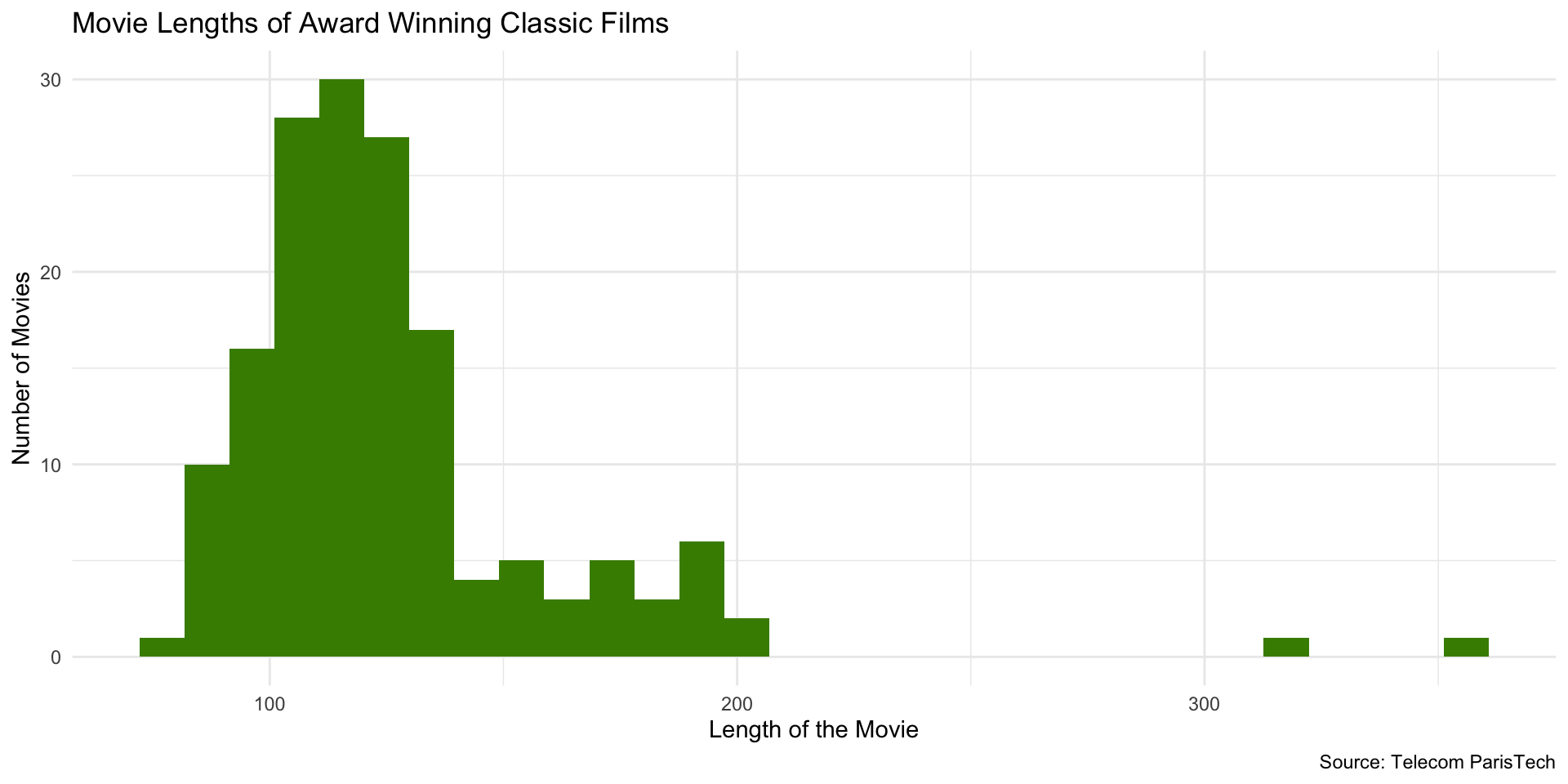
Histogram Code
Histogram Code
Note that you only need to specify the x-axis variable in the aes() function. ggplot2 will automatically visualize the y-axis for a histogram.
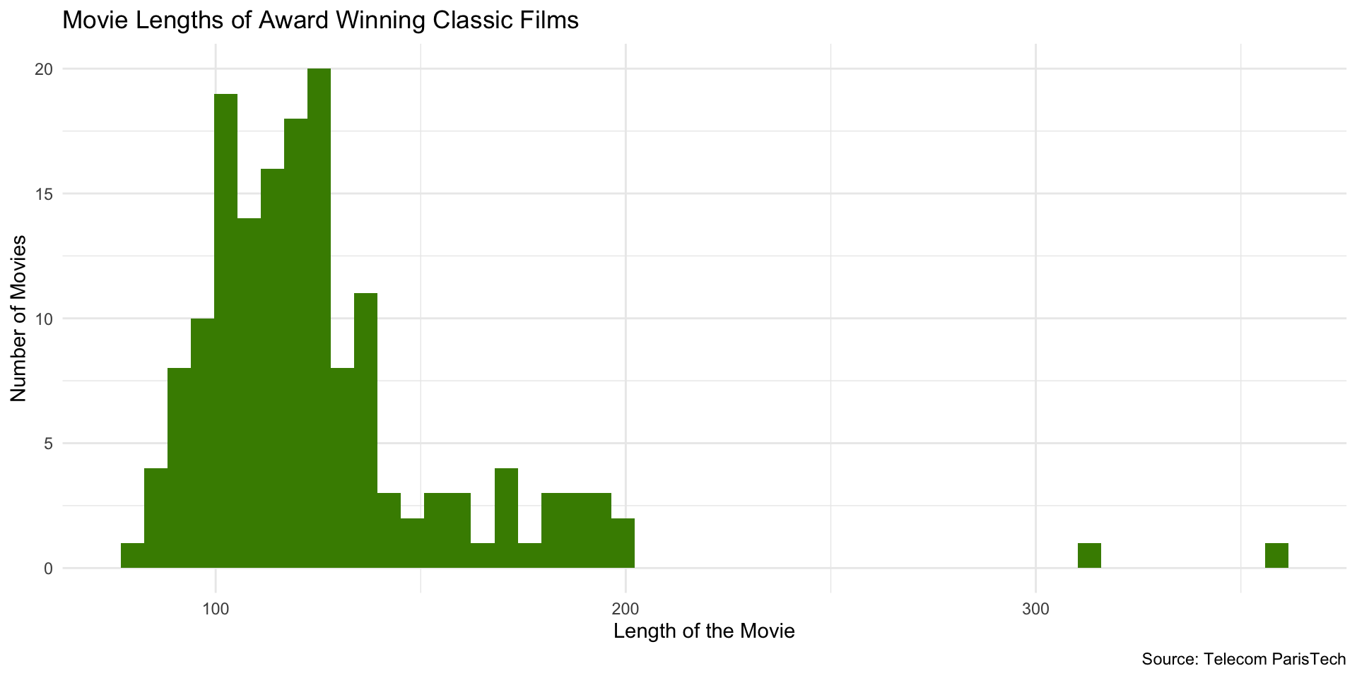
Change Number of Bins
Change number of bins (bars) using bins or binwidth arguments (default number of bins = 30):
At 50 bins…
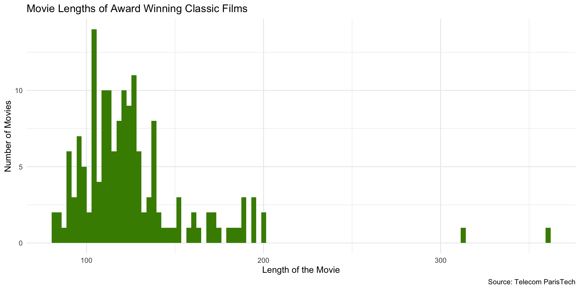
At 100 bins…probably too many!
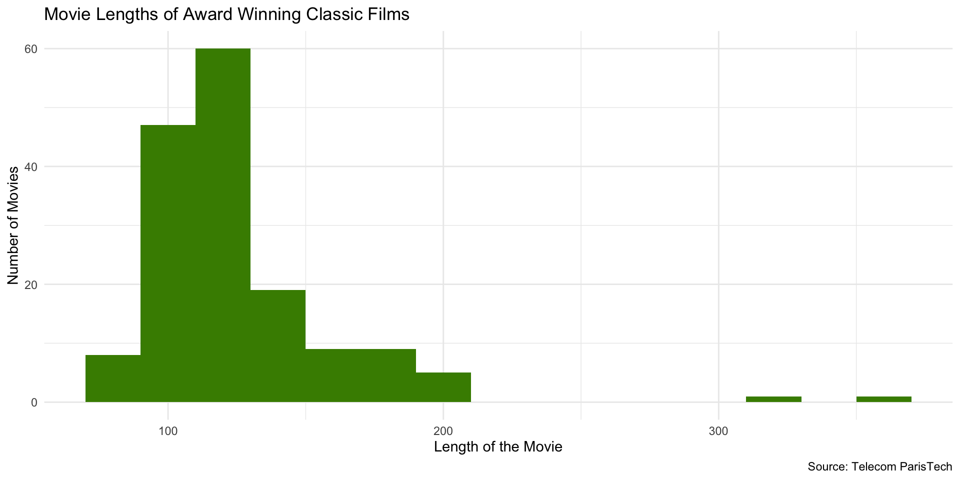
Using binwidth instead of bins…
Setting binwidth to 2…
Change from Count to Density
For densities, the total area sums to 1. The height of a bar represents the probability of observations in that bin (rather than the number of observations).
Which gives us…
Try it out!
- Pick a variable that you want to explore the distribution of
- Make a histogram
- Only specify
x =inaes() - Specify geom as
geom_histogram
- Only specify
- Choose color for bars
- Choose appropriate labels
- Change number of bins
- Change from count to density
10:00
Line Charts
- Line charts are used to show trends over time
- You especially want to use a line chart when you have multiple cases or categories that you want to compare over time
Line Chart Example
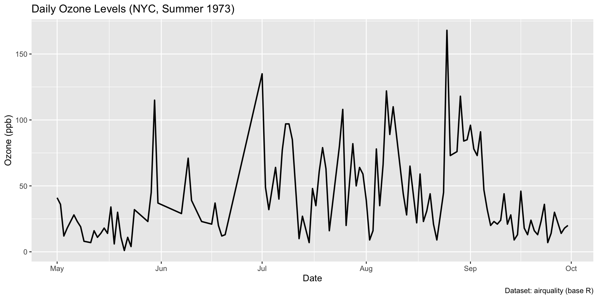
Setup some data
Here is the plot code…
Use geom_line() to specify a line chart…
Add third dimension to the aes() call for line color…
Modify the legend title…
Your Turn!
- Check which datasets you have in R by typing
data()in the Console. - Select a dataset to visualize.
- Adjust setup code to filter data based on a variables/feature column.
- Visualize with
geom_line().
10:00
Scatter Plots
- Scatter plots are used to show the relationship between two variables
- Frequently the outcome variable is on the y-axis and the predictor variable is on the x-axis
- In addition to the points, you can use color, size, and shape to add more information to the plot
Scatter Plot
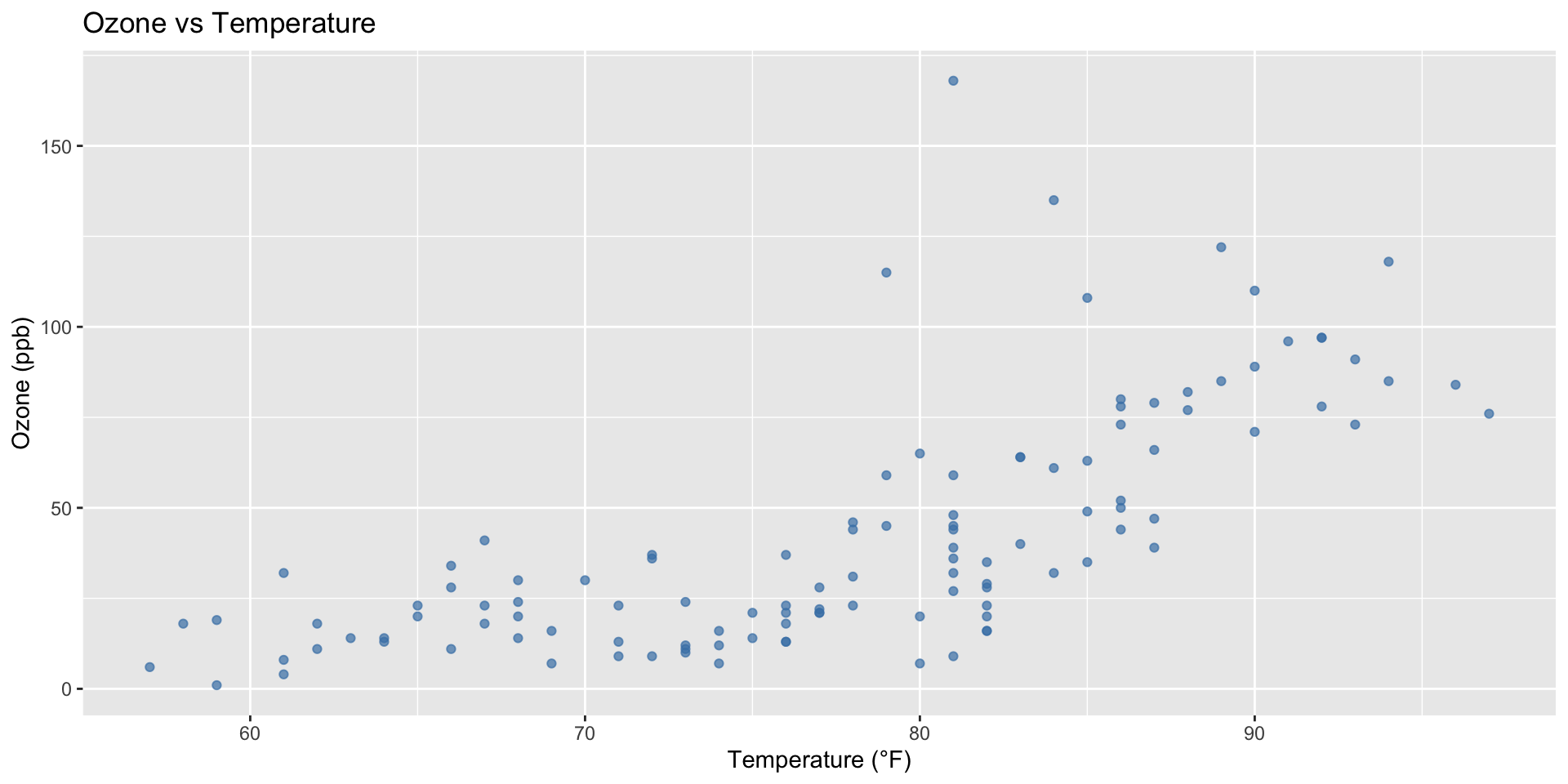
Scatter Plot
Use geom_point()…
Add a Trend Line
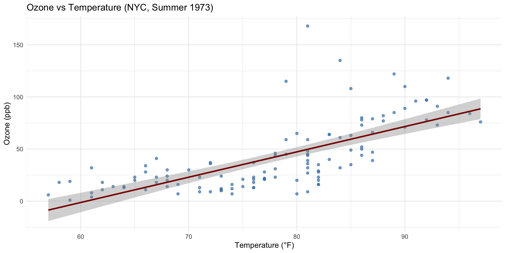
Add a Trend Line
Plotly
We can change this to be an interactive plot with plotly.
Plotly
Assign the last plot to the variable p_layers.
Which Plot Should You Use?
- Trends in stock process over time
- Distribution of income in a country
- Comparison of FLFP across MENA countries
- Relationship between poverty and inequality (cross-nationally)
Which Geom Would You Use?
- Column chart
- Histogram
- Line chart
- Scatter plot
Other Plots and Geometries
Box Plot
geom_boxplot()Violin Plot
geom_violin()Density Plot
geom_density()Bar Plot (Categorical)
geom_bar()Heatmap
geom_tile()
Area Plot
geom_area()Dot Plot
geom_dotplot()Pie Chart
(usually a bar plot withcoord_polar())Ridgeline Plot
ggridges::geom_density_ridges()Map Plot (Choropleth)
geom_polygon()
Messages, Warnings and Errors
- Messages tell you what R is doing
- Warnings tell you that something might be wrong
- Errors tell you that something is definitely wrong
- Locate the error line number in the console and check your code
- Error line tells you about where the error occurred, not exact
- Errors are normal, don’t freak out!
- In fact, you should practice making errors to learn how to fix them
Resources
- Have a look at the documentation for ggplot2
- Familiarize yourself with the
ggplot2cheatsheet