Advanced Data Visualization Techniques
Sarah Cassie Burnett
September 16, 2025
Announcements
- Online quiz posted at the end of class, due tomorrow.
- Coding Assignment 1 is due by 11:59 pm tonight.
- Submit the assignment on Gradescope.
- Minor final project assignment due Thursday.

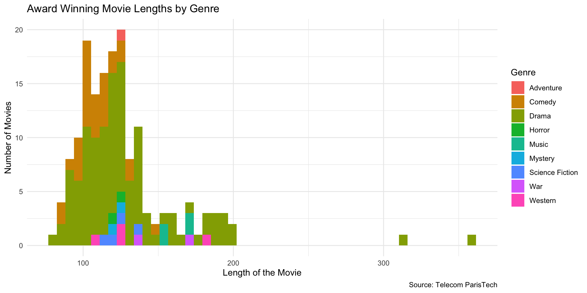
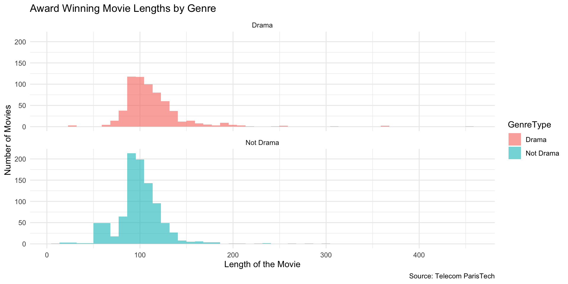
Histogram: Award-Winning Movie Lengths (by Genre)
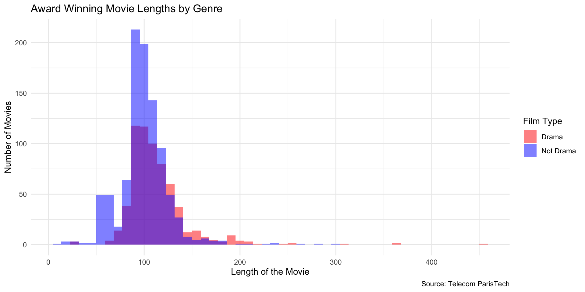
Overlay Two Groups
(Drama vs Not Drama)
Use mutate to instead create a new column of data with this information
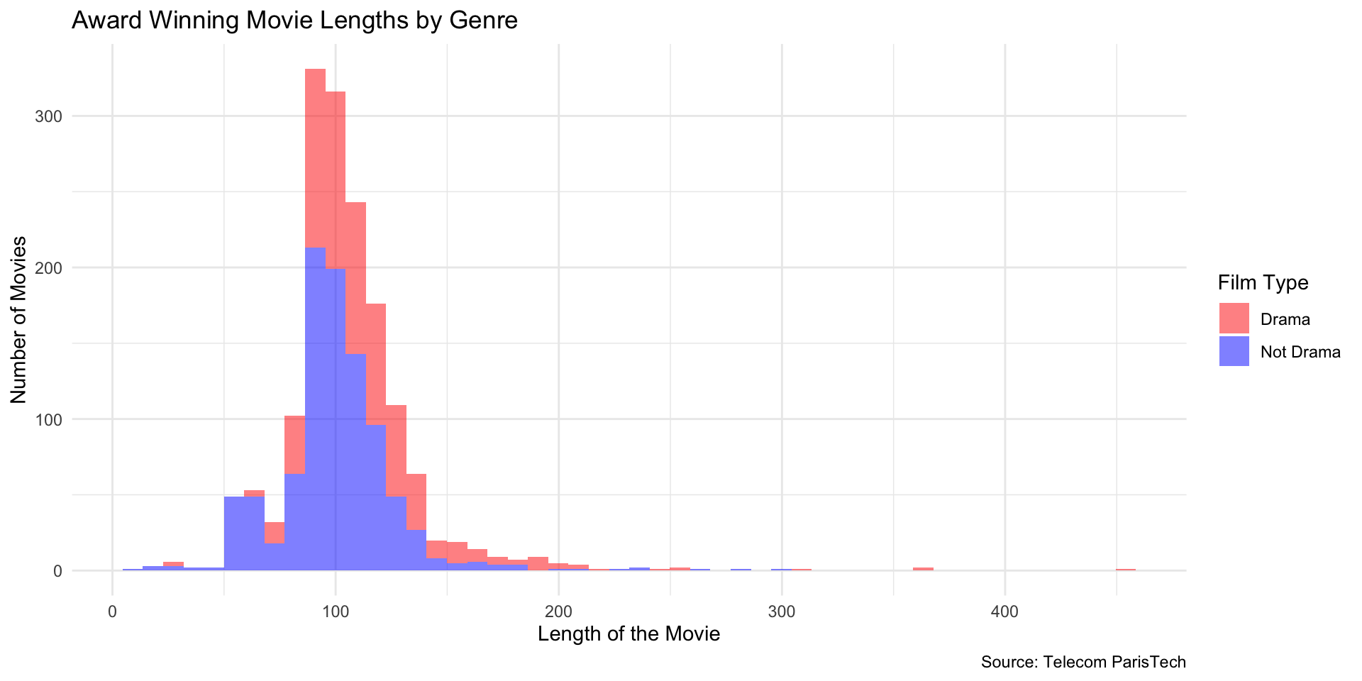
Faceted Histogram (Drama vs Not Drama)
Density Comparison: Linear vs Log (Side-by-Side)
library(patchwork)

d_linear <- ggplot(diamonds, aes(x = price, y = after_stat(density))) +
  geom_histogram(bins = 100, fill = "hotpink4", color = "white") +
  labs(
    title = "Diamond Prices (Linear X)",
    x = "Price",
    y = "Density"
  ) +
  theme_minimal()

d_log <- ggplot(diamonds, aes(x = price, y = after_stat(density))) +
  geom_histogram(bins = 100, fill = "forestgreen", color = "white") +
  scale_x_log10() +
  labs(
    title = "Diamond Prices (Log10 X)",
    x = "Price (log scale)",
    y = "Density"
  ) +
  theme_minimal()

d_linear + d_log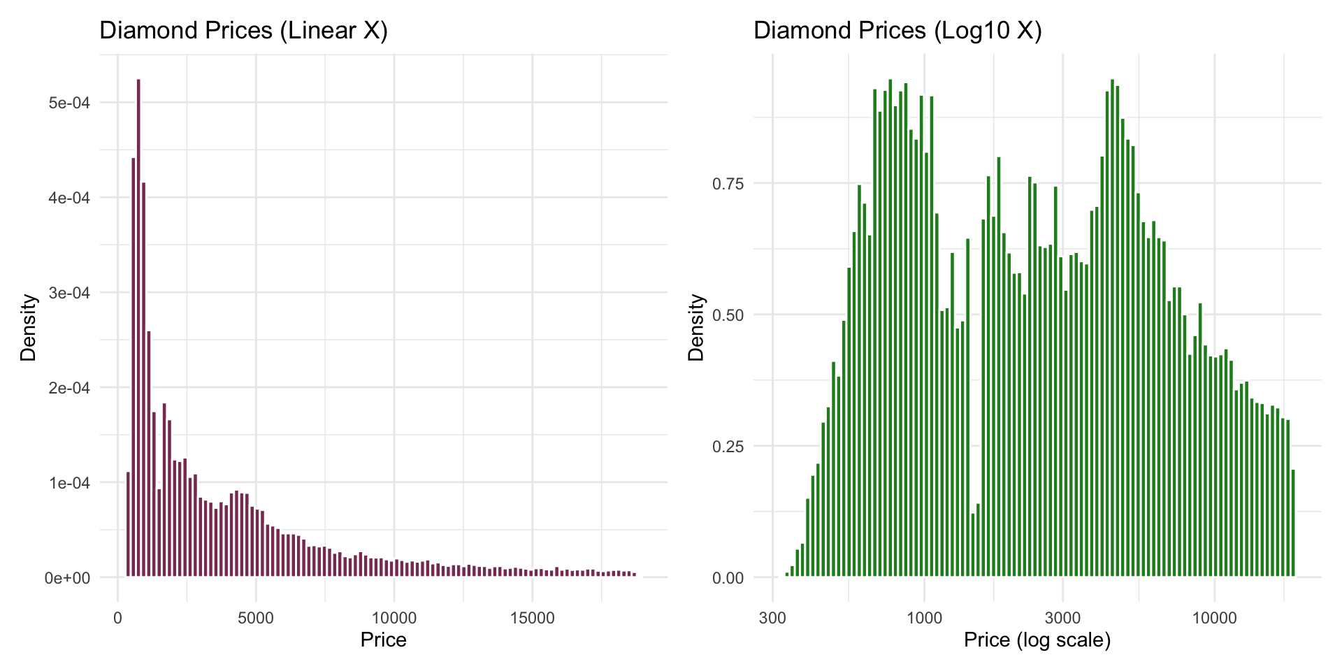
Density Comparison: Linear vs Log (Side-by-Side)

Color Scales: Viridis (Discrete)