The probability of rolling a 1, 2, 3, 4, 5, or 6 with a fair die is equal for each outcome.
Outcomes vs. Events
Outcome:
A single possible result of an experiment.
Example: rolling a 4 on a fair die.
Event:
A collection or condition involving one or more outcomes.
Example: rolling an even number → {2, 4, 6}.
Probability of this event: \(P(x\text{ is even}) = \frac{3}{6} = 0.5\)
Outcomes are individual results; Events are groups of outcomes we assign probabilities to.
Uniform Distribution
Let’s Roll One!
We could roll a real die, but it would take a while to collect enough data.
Instead, we’ll simulate rolls in R.
sample(1:6, size =1)
[1] 5
Simulation is the process of using a computer to mimic a physical experiment.
Uniform Distribution
Simulate rolling die
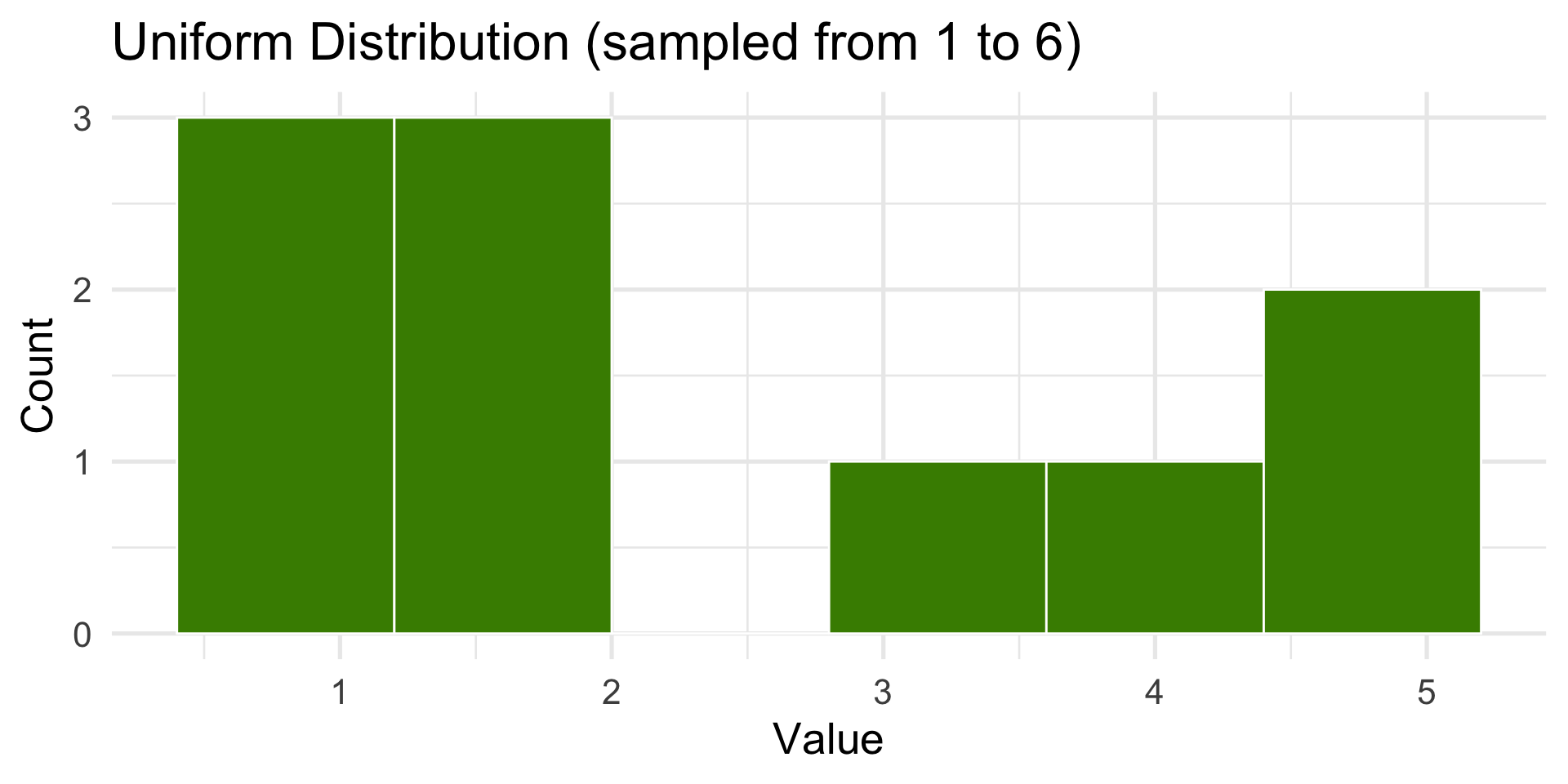
Let’s simulate 10 die rolls… 1000 die rolls.
rolls <-sample(1:6, size =10, replace =TRUE)rolls
[1] 1 2 2 6 3 3 2 3 5 6
The Law of Large Numbers (LLN) is a fundamental principle in probability and statistics that describes how the results of random events become more predictable as the number of trials increases.
Uniform Distribution
10 die rolls
Code
library(tidyverse)N <-10dist <-tibble(x =sample(1:6, size = N, replace =TRUE))ggplot(dist, aes(x)) +geom_histogram(bins =6, fill ="chartreuse4", color ="white") +labs(title ="Uniform Distribution (sampled from 1 to 6)",x ="Value",y ="Count" ) +theme_minimal(base_size =20)
Uniform Distribution
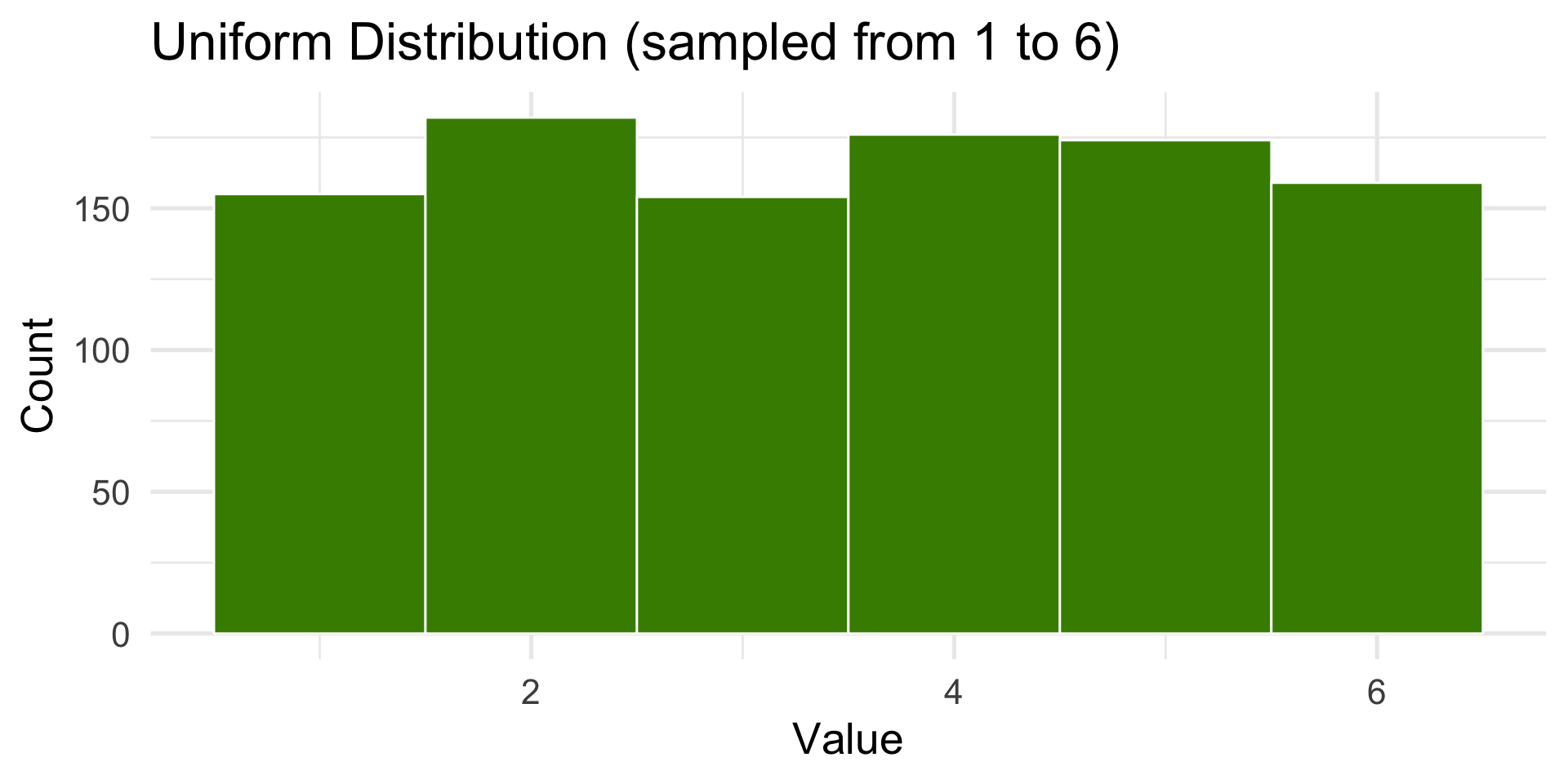
1000 die rolls
Code
set.seed(7)N <-1000dist <-tibble(x =sample(1:6, size = N, replace =TRUE))ggplot(dist, aes(x)) +geom_histogram(bins =6, fill ="chartreuse4", color ="white") +labs(title ="Uniform Distribution (sampled from 1 to 6)",x ="Value",y ="Count" )+theme_minimal(base_size =20)
Uniform Distribution
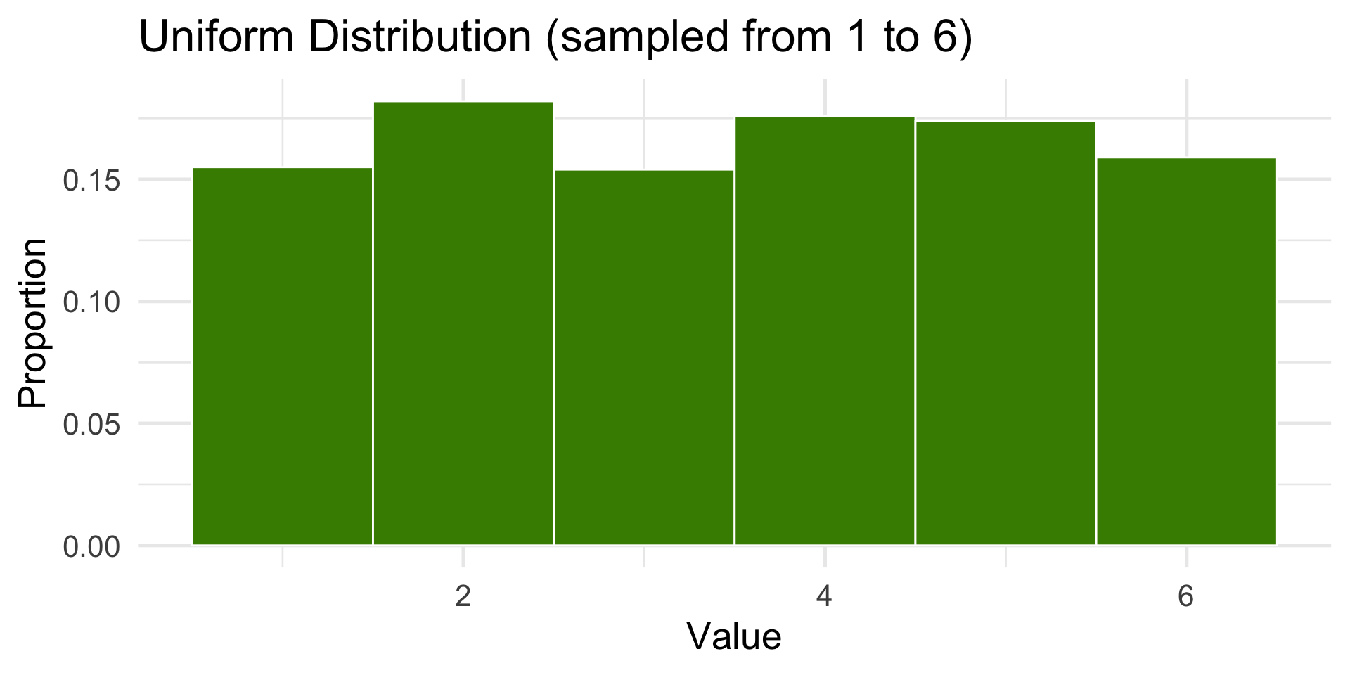
1000 die rolls as a proportion
Code
set.seed(7)N <-1000dist <-tibble(x =sample(1:6, size = N, replace =TRUE))hist <-ggplot(dist, aes(x)) +geom_histogram(aes(y =after_stat(count /sum(count))), bins =6, fill ="chartreuse4", color ="white") +labs(title ="Uniform Distribution (sampled from 1 to 6)",x ="Value",y ="Proportion" ) +theme_minimal(base_size =20)hist
Histograms
Used to represent the distribution of a continuous variable
The x-axis represents the range of values
The y-axis represents the frequency of each value
The bars represent the number of observations in each range or “bin”
Adjust bins and bin widths to best view the distribution
The shape of the histogram can tell us a lot about the distribution of the data
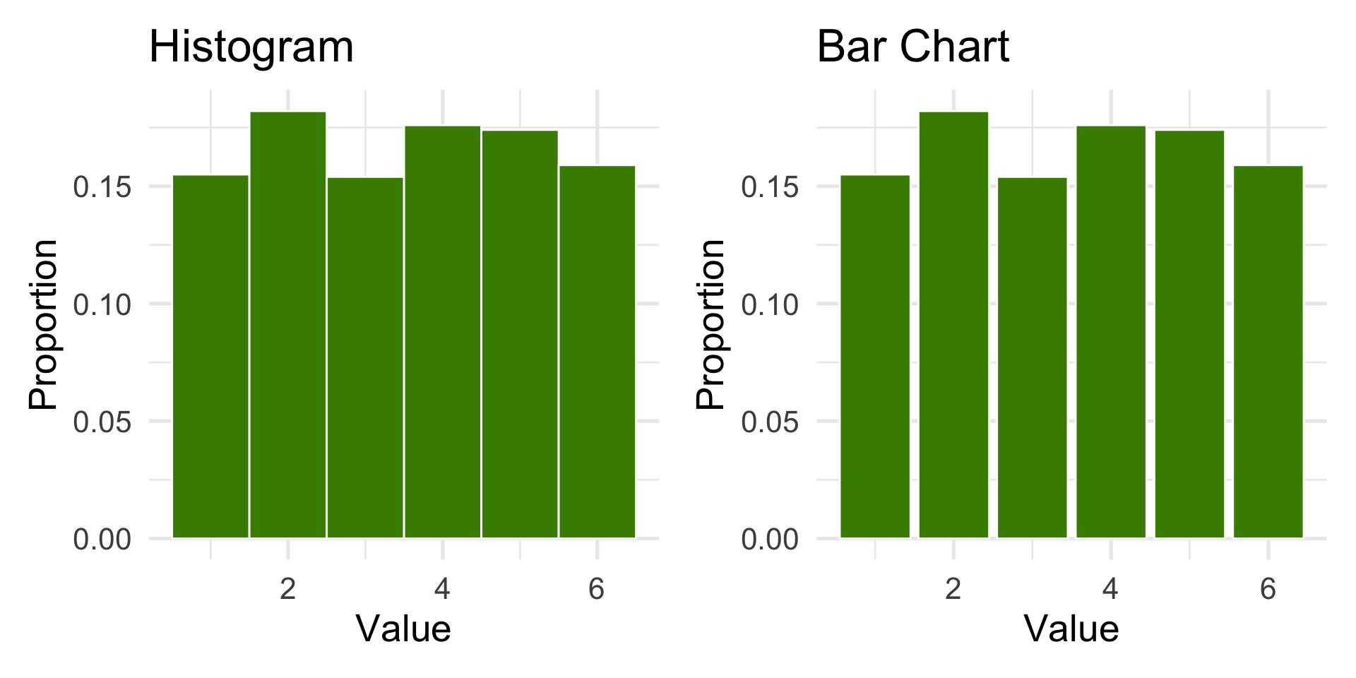
Aside on the Die Rolls Example
A die roll is a categorical variable: the outcomes {1, 2, 3, 4, 5, 6} are labels.
The bar chart is the correct choice to display categorical frequencies.
In practice, for discrete outcomes, geom_bar() is preferred.
Many real-world variables follow non-uniform distributions.
In R, there are built in functions to generate these distributions:
runif() — Uniform distribution
rnorm() — Normal (Gaussian) distribution
rpois() — Poisson distribution
rexp() — Exponential distribution
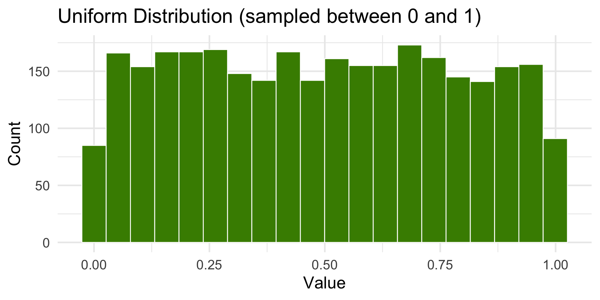
Uniform
All outcomes are equally likely.
Code
N <-3000dist <-tibble(x =runif(N, min =0, max =1))ggplot(dist, aes(x)) +geom_histogram(bins =20, fill ="chartreuse4", color ="white") +labs(title ="Uniform Distribution (sampled between 0 and 1)",x ="Value",y ="Count" ) +theme_minimal(base_size =20)
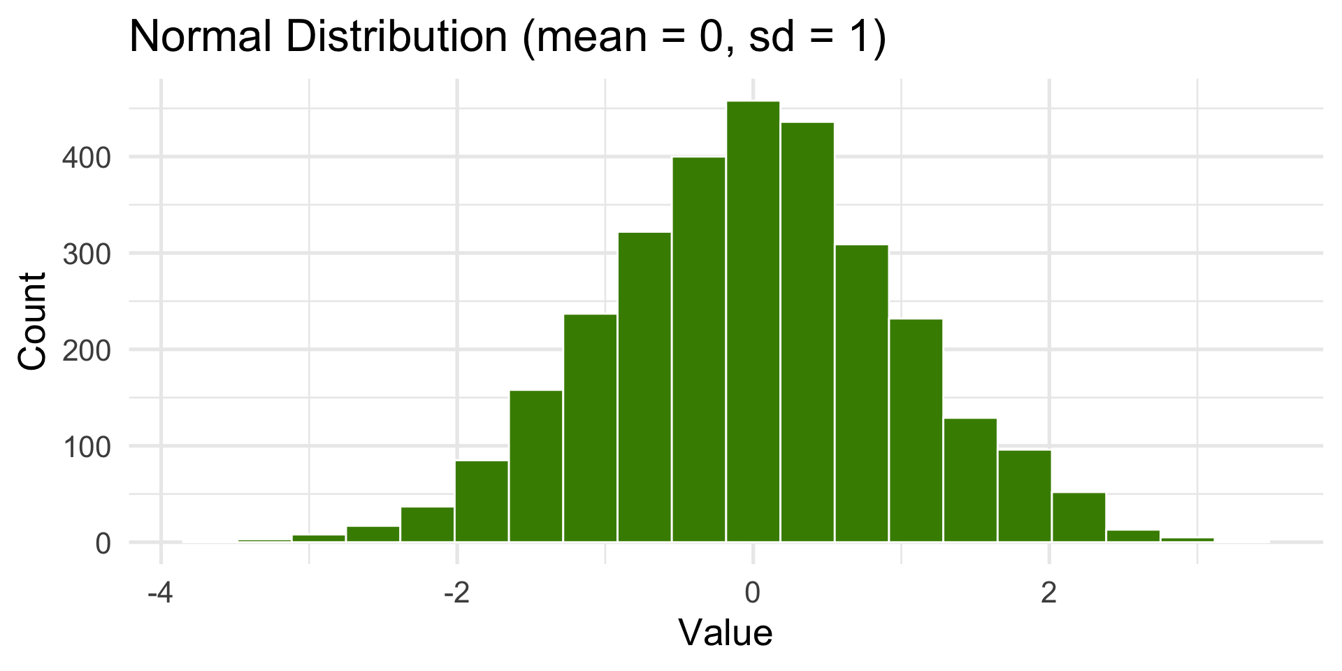
Normal or Gaussian Distribution
Also known as the bell-shaped or standard distribution.
It’s the most common distribution in statistics and math.
Code
dist <-tibble(x =rnorm(N, mean =0, sd =1))ggplot(dist, aes(x)) +geom_histogram(bins =20, fill ="chartreuse4", color ="white") +labs(title ="Normal Distribution (mean = 0, sd = 1)",x ="Value", y ="Count") +theme_minimal(base_size =20)
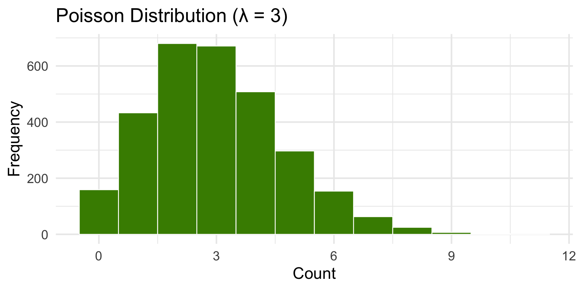
Poisson Distribution
Used for counts of random, independent events.
(e.g., number of emails per hour or bus arrivals.)
Code
dist <-tibble(x =rpois(N, lambda =3))ggplot(dist, aes(x)) +geom_histogram(binwidth =1, fill ="chartreuse4", color ="white") +labs(title ="Poisson Distribution (λ = 3)",x ="Count", y ="Frequency") +theme_minimal(base_size =20)
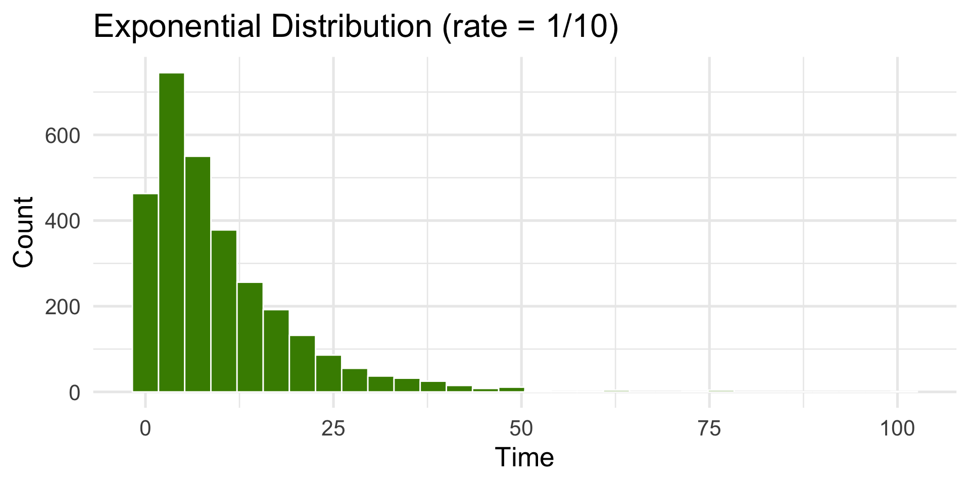
Exponential Distribution
Used for waiting times between random events.
Code
dist <-tibble(x =rexp(N, rate =1/10))ggplot(dist, aes(x)) +geom_histogram(bins =30, fill ="chartreuse4", color ="white") +labs(title ="Exponential Distribution (rate = 1/10)",x ="Time", y ="Count") +theme_minimal(base_size =20)
Describing Distribution Shape
Number of peaks (modes): unimodal, bimodal, multimodal
Describing Distribution Shape
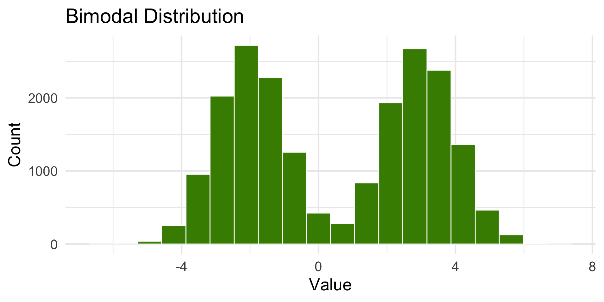
Bimodal Distribution
Two peaks (like two distributions are combined).
Describing Distribution Shape
Number of peaks (modes): unimodal, bimodal, multimodal
Direction of skew: left-skewed or right-skewed
Describing Distribution Shape
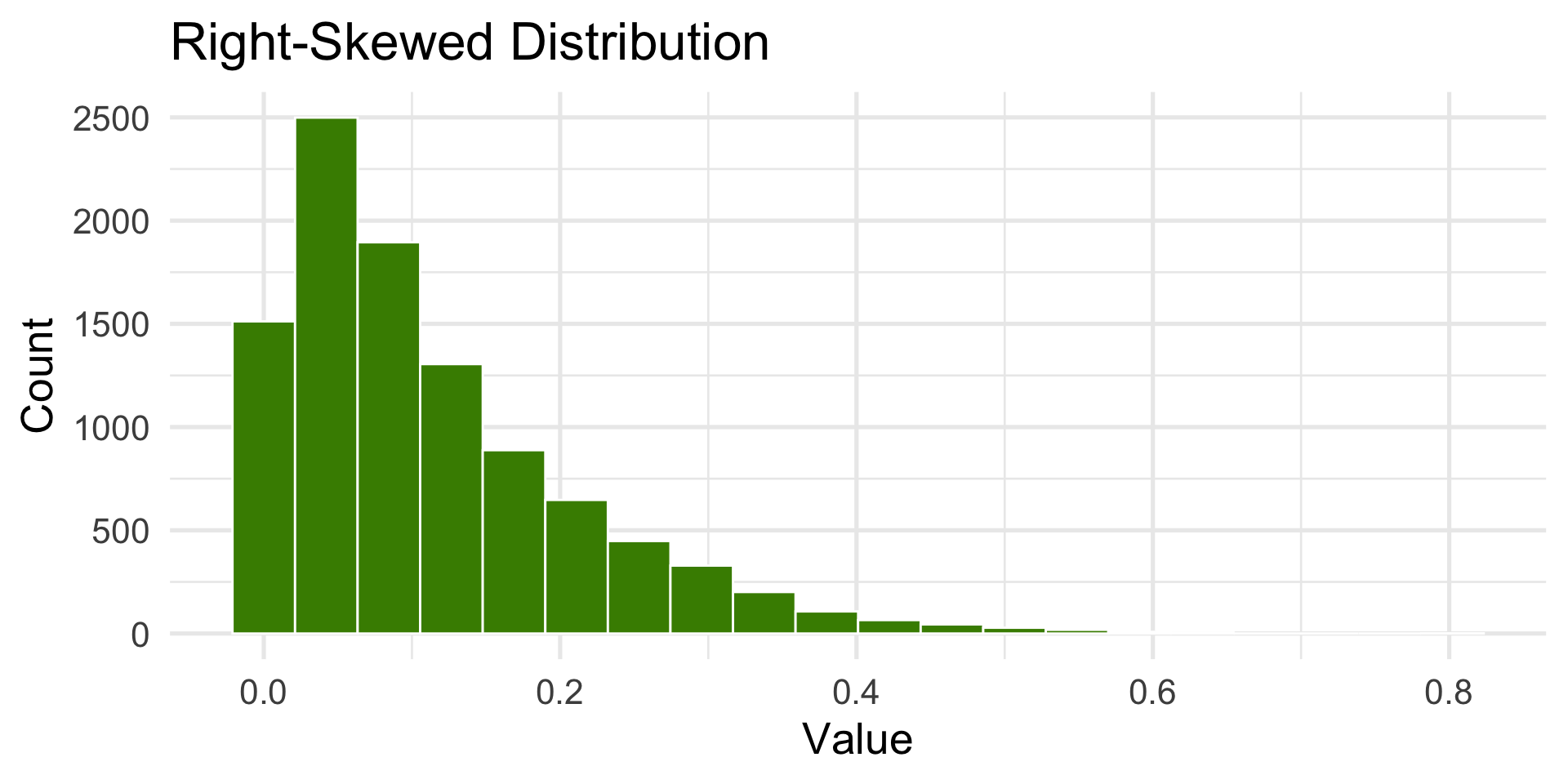
Right-Skewed Distribution
Tail extends to the right.
Describing Distribution Shape
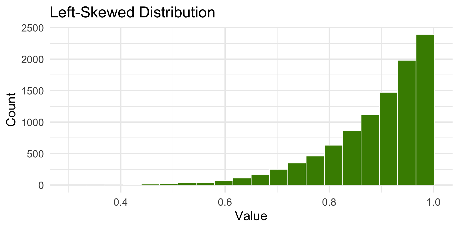
Left-Skewed Distribution
Tail extends to the left.
Try it out with real data!
Which describe the shape each variable:
palmerpenguins::penguins$body_mass_g (body mass of penguins).
faithful$waiting (waiting time between Old Faithful eruptions).
ggplot2::diamonds$price (price of diamonds).
Challenge: How would you describe ggplot2::diamonds$cut (cut of diamonds)?
(See the next slide for the code for the plots.)
05:00
Code for activity
#1library(palmerpenguins)ggplot(penguins, aes(x = body_mass_g)) +geom_histogram(bins =20, fill ="chartreuse4", color ="white") +labs(title ="Penguin Body Mass", x ="Body Mass (g)", y ="Count")#2ggplot(faithful, aes(x = waiting)) +geom_histogram(bins =30, fill ="chartreuse4", color ="white") +labs(title ="Old Faithful Waiting Times", x ="Minutes", y ="Count")#3ggplot(diamonds, aes(x = price)) +geom_histogram(bins =50, fill ="chartreuse4", color ="white") +labs(title ="Diamond Prices", x ="Price (USD)", y ="Count")#4ggplot(diamonds, aes(x = cut)) +geom_bar(fill ="chartreuse4", color ="white") +labs(title ="Diamond Cut Quality", x ="Cut", y ="Count")
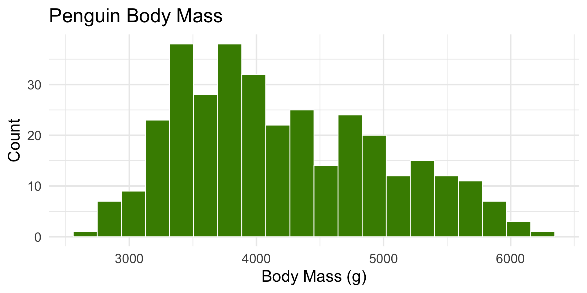
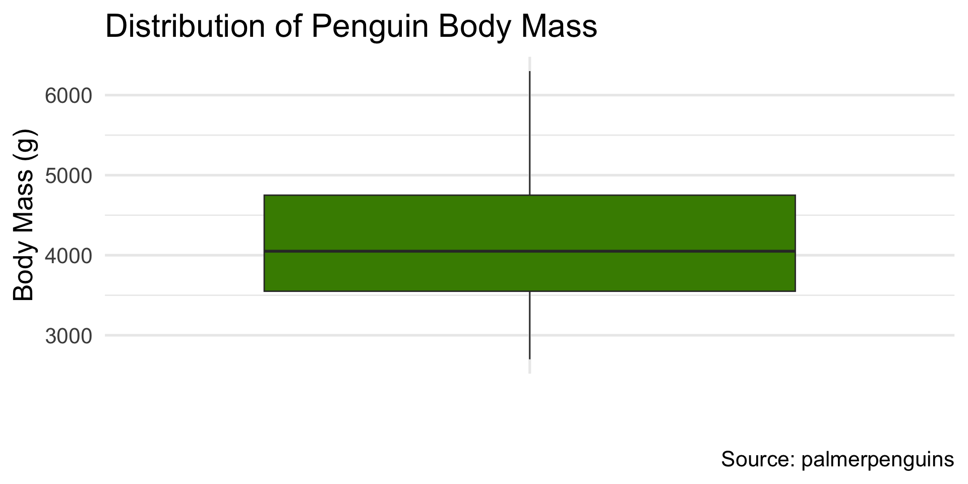
body mass of penguins
Code
library(palmerpenguins)ggplot(penguins, aes(x = body_mass_g)) +geom_histogram(bins =20, fill ="chartreuse4", color ="white") +labs(title ="Penguin Body Mass", x ="Body Mass (g)", y ="Count")+theme_minimal(base_size =20)
Slightly right-skewed — heavier penguins pull the tail.
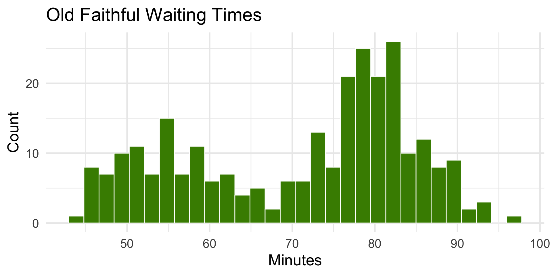
waiting time between Old Faithful eruptions
Code
ggplot(faithful, aes(x = waiting)) +geom_histogram(bins =30, fill ="chartreuse4", color ="white") +labs(title ="Old Faithful Waiting Times", x ="Minutes", y ="Count")+theme_minimal(base_size =20)
Bimodal — two eruption types (short vs. long).
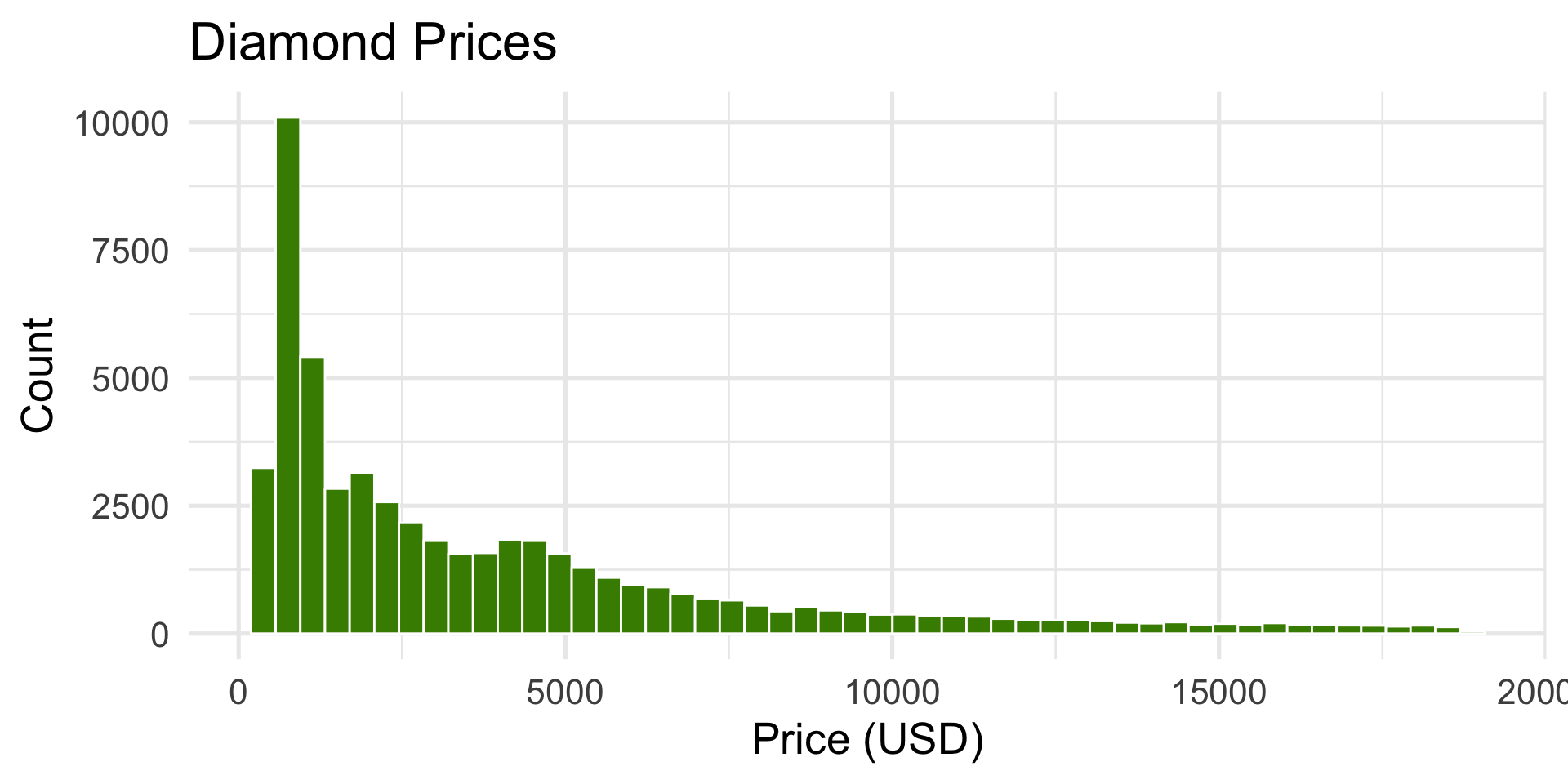
price of diamonds
Code
ggplot(diamonds, aes(x = price)) +geom_histogram(bins =50, fill ="chartreuse4", color ="white") +labs(title ="Diamond Prices", x ="Price (USD)", y ="Count")+theme_minimal(base_size =20)
Hard right-skewed — many small/cheap diamonds, few very expensive ones.
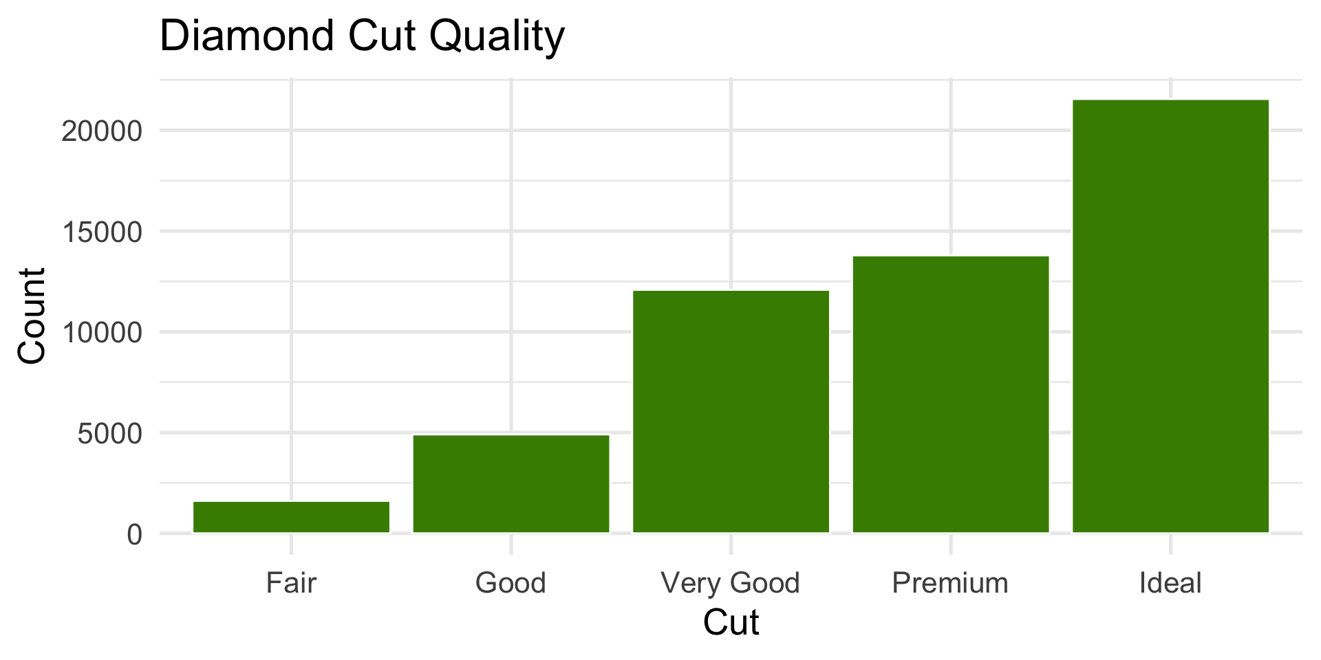
cut of diamonds
Code
ggplot(diamonds, aes(x = cut)) +geom_bar(fill ="chartreuse4", color ="white") +labs(title ="Diamond Cut Quality", x ="Cut", y ="Count")+theme_minimal(base_size =20)
Most diamonds are in the higher-quality categories (Ideal and Premium).
We describe the distribution of categories, not skewness for categorical variables.
Describing Distribution Shape
Number of peaks (modes): unimodal, bimodal, multimodal
Direction of skew: left-skewed or right-skewed
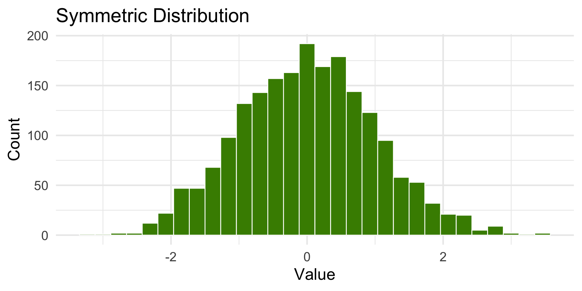
Symmetry: is the distribution balanced?
Symmetric distribution
The center represents the typical (expected) value, and both tails are similar in length and shape.
How the Center is measured
How do we find where our data is centered?
Example:
Data: [2, 5, 3, 25, 5]
The mean is the average of the values. Common measure of central tendency but sensitive to outliers.
Mean = (2 + 3 + 5 + 5 + 25) / 5 = 8
The median is the value that separates the higher half from the lower half of the data.
Ordered Data: [2, 3, 5, 5, 25], Median = 5
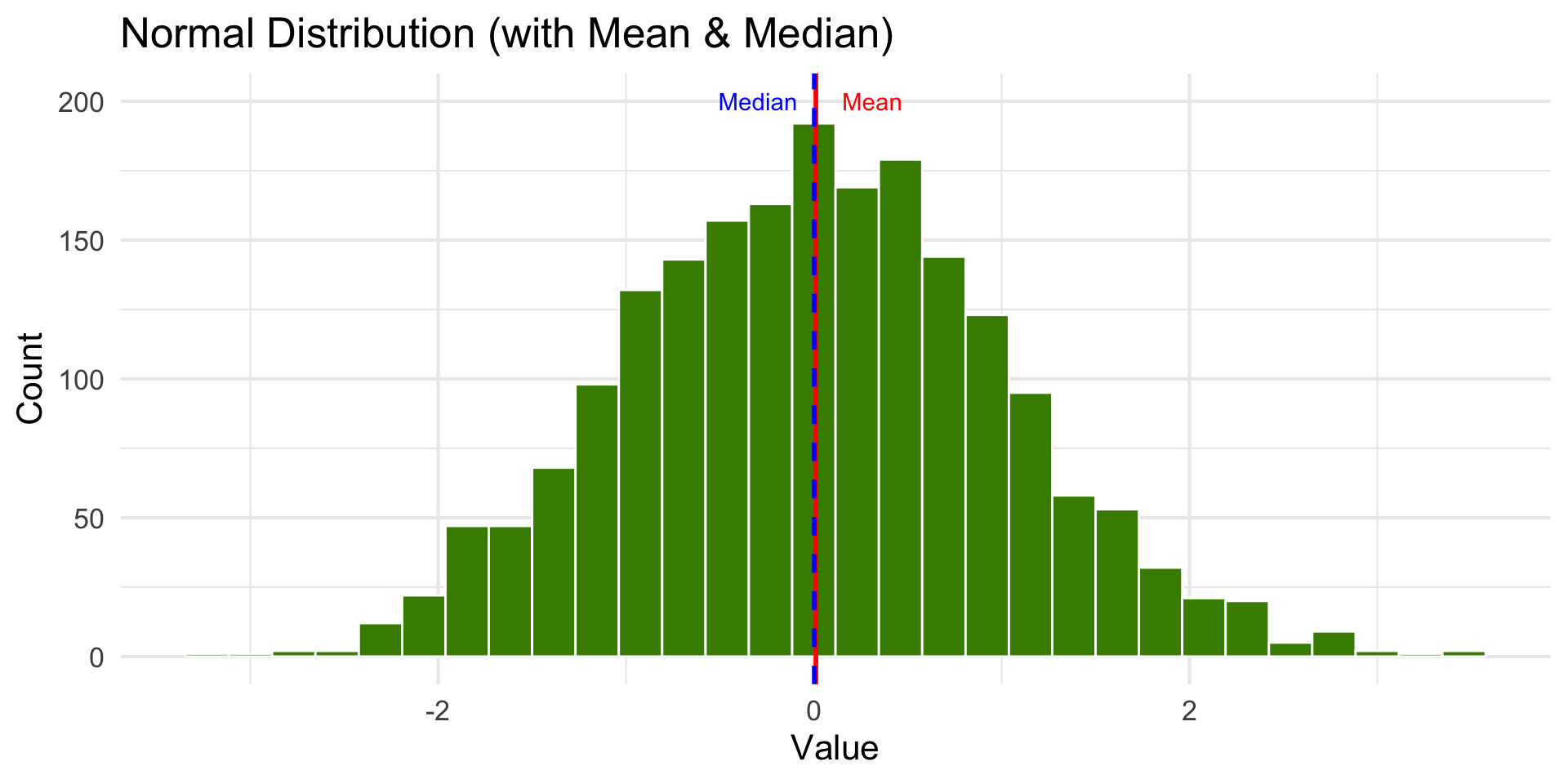
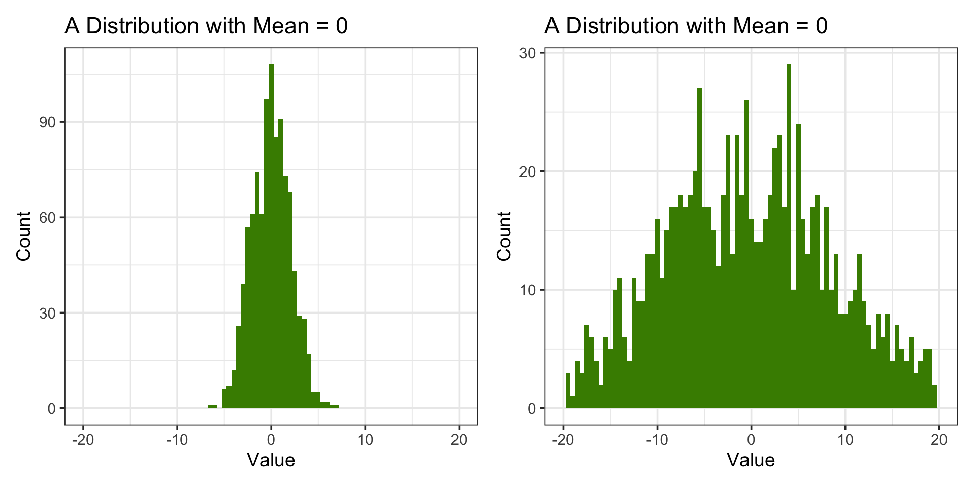
Normal Distribution
Code
set.seed(7)dist <-tibble(x =rnorm(2000, mean =0, sd =1))stats <- dist |>summarize(mean_x =mean(x),median_x =median(x) )ggplot(dist, aes(x)) +geom_histogram(bins =30, fill ="chartreuse4", color ="white") +geom_vline(aes(xintercept = stats$mean_x), color ="red", linewidth =1) +geom_vline(aes(xintercept = stats$median_x), color ="blue", linewidth =1, linetype ="dashed") +labs(title ="Normal Distribution (with Mean & Median)",x ="Value",y ="Count" ) +annotate("text", x = stats$mean_x +0.3, y =200, label ="Mean", color ="red") +annotate("text", x = stats$median_x -0.3, y =200, label ="Median", color ="blue") +theme_minimal(base_size =16)
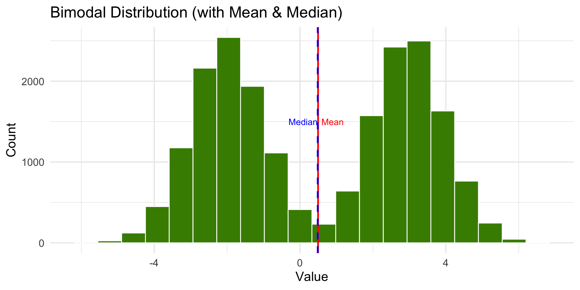
Bimodal Distribution
Code
library(ggplot2)library(tibble)library(dplyr)set.seed(1)dist <-tibble(x =c(rnorm(10000, mean =-2, sd =1),rnorm(10000, mean =3, sd =1)))stats <- dist |>summarize(mean_x =mean(x),median_x =median(x) )ggplot(dist, aes(x)) +geom_histogram(bins =20, fill ="chartreuse4", color ="white") +geom_vline(aes(xintercept = stats$mean_x), color ="red", linewidth =1) +geom_vline(aes(xintercept = stats$median_x), color ="blue", linewidth =1, linetype ="dashed") +labs(title ="Bimodal Distribution (with Mean & Median)",x ="Value", y ="Count") +annotate("text", x = stats$mean_x +0.4, y =1500, label ="Mean", color ="red") +annotate("text", x = stats$median_x -0.4,y =1500, label ="Median", color ="blue") +theme_minimal(base_size =16)
Data like this might be the combination of two groups. Taking the mean is not meaningful until the groups are separated.
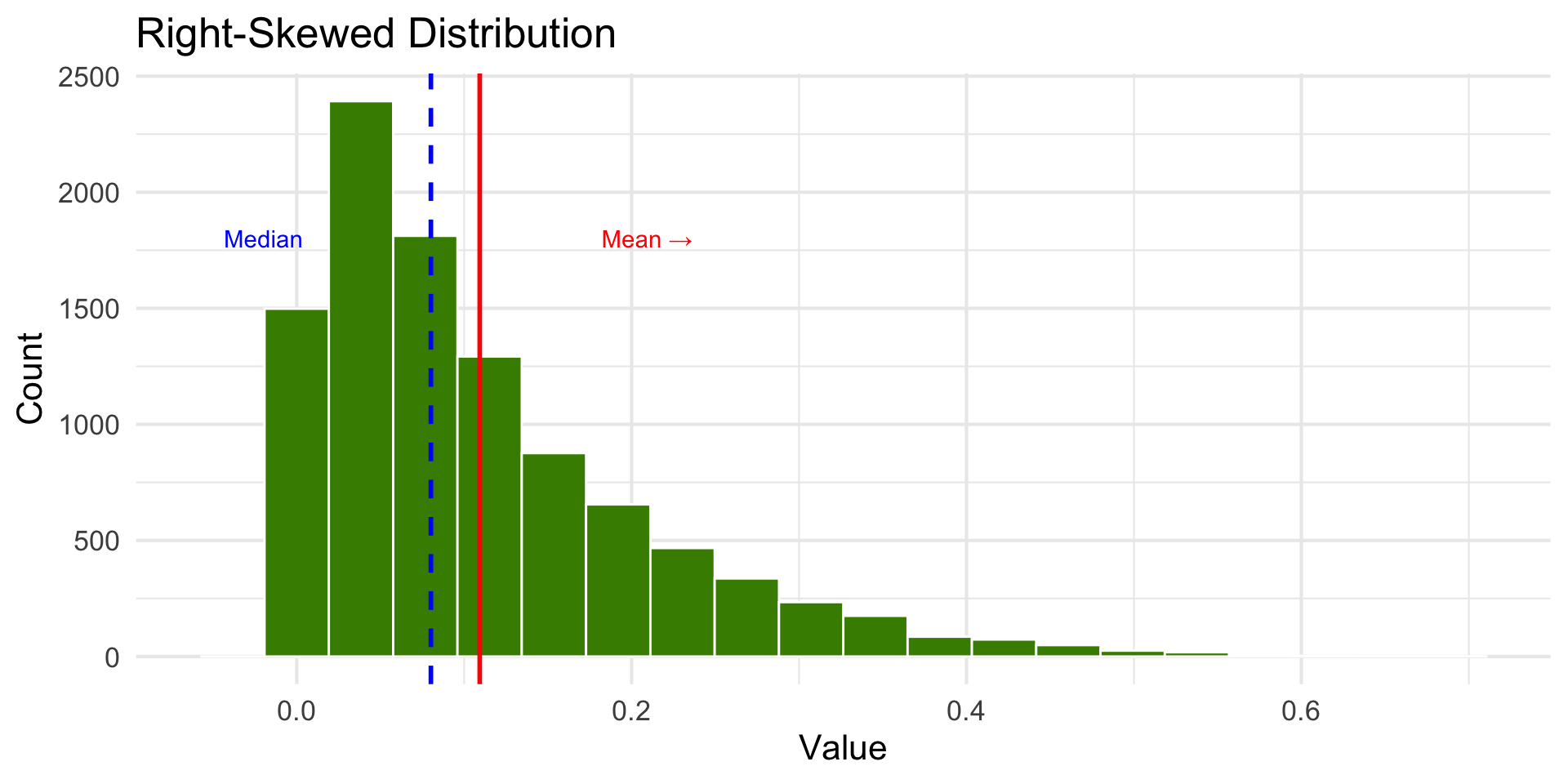
Right-Skewed Distribution
Code
dist <-tibble(x =rbeta(10000, 1, 8))stats <- dist |>summarize(mean_x =mean(x),median_x =median(x) )ggplot(dist, aes(x)) +geom_histogram(bins =20, fill ="chartreuse4", color ="white") +geom_vline(aes(xintercept = stats$mean_x), color ="red", linewidth =1) +geom_vline(aes(xintercept = stats$median_x), color ="blue", linewidth =1, linetype ="dashed") +labs(title ="Right-Skewed Distribution", x ="Value", y ="Count") +annotate("text", x = stats$mean_x +0.1, y =1800, label ="Mean →", color ="red") +annotate("text", x = stats$median_x -0.1, y =1800, label ="Median", color ="blue") +theme_minimal(base_size =16)
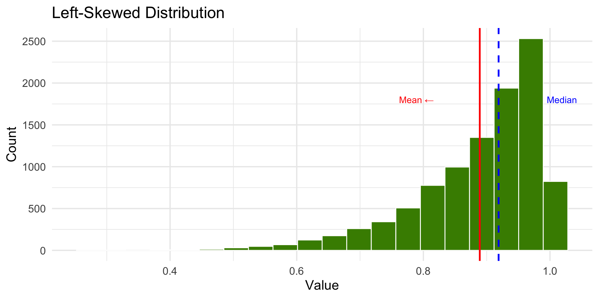
Left-Skewed Distribution
Code
dist <-tibble(x =rbeta(10000, 8, 1))stats <- dist |>summarize(mean_x =mean(x),median_x =median(x) )ggplot(dist, aes(x)) +geom_histogram(bins =20, fill ="chartreuse4", color ="white") +geom_vline(aes(xintercept = stats$mean_x), color ="red", linewidth =1) +geom_vline(aes(xintercept = stats$median_x), color ="blue", linewidth =1, linetype ="dashed") +labs(title ="Left-Skewed Distribution", x ="Value", y ="Count") +annotate("text", x = stats$mean_x -0.1, y =1800, label ="Mean ←", color ="red") +annotate("text", x = stats$median_x +0.1, y =1800, label ="Median", color ="blue")+theme_minimal(base_size =16)
Describing Distribution Shape
Number of peaks (modes): unimodal, bimodal, multimodal
Direction of skew: left-skewed or right-skewed
Symmetry: is the distribution balanced?
Outliers: extreme values stretching or distorting shape
Summary: Center measurements
The mean works well as a summary statistic when the distribution is relatively symmetric.
With skewed distributions, the mean is sensitive to extreme values.
The median is preferred when data is not symmetric.
Except when distributions are skewed or bimodal (or multi-modal).
Bimodal data should be processed by separating into groups based on categories or using clustering.
Measures of Central Tendency
We can use statistics like mean or median to describe the center of a variable.
We can visualize the entire distribution to characterize the distribution of the variable.
We should also say something about the spread of the distribution.
Why Measure and Visualize Spread?
Measures of Spread: Min-Max Range
maximum (max())
minimum (min())
range (max - min values)
Good to know but not any insight about the distribution or if there are outliers.
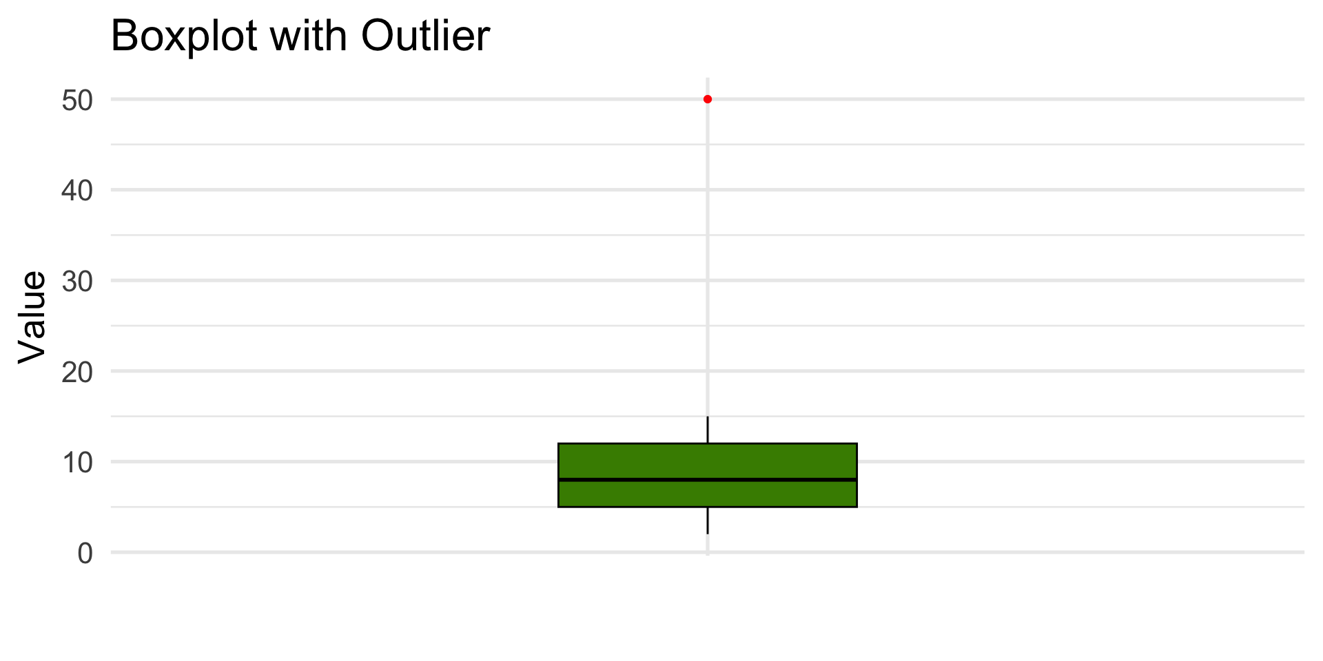
A box plot is a graphical representation of the distribution based on the median and quartiles.
It is a standardized way of displaying the distribution of data based on a five number summary: minimum, first quartile, median, third quartile, and maximum.
Code
library(palmerpenguins)library(ggplot2)ggplot(penguins, aes(x ="", y = body_mass_g)) +geom_boxplot(fill ="chartreuse4") +labs(x ="",y ="Body Mass (g)",title ="Distribution of Penguin Body Mass",caption ="Source: palmerpenguins" ) +theme_minimal(base_size =20)