result |> head(7)Homework 2: Data Wrangling and Visualization
In this assignment, you’ll wrangle, clean, summarize, and plot the NOAA climate data of monthly temperature average at various weather stations.
Instructions
You will write some code which analyzes data and outputs tables and figures. You can work in an .R script, but in the end, you should carefully transfer your work to index.qmd. This will be another post for the DATS 1001 blog, which you’ll add to a new folder assignment2/ under posts/.
For the submission to Gradescope, you need to submit index.qmd and a pdf version (index.pdf) of the corresponding index.html found in _site/posts/assignment2/ after you do your final rendering. No need to preserve their directories. An autograder is now programmed into Gradescope to check the correct files are uploaded and give 2 points.
1. Read the CSV files into R
We’ll work with three tables as tibbles:
- temperatures: average monthly temperatures at various weather stations
- stations: station information
- countries: country codes
First, load the data into three tables, storing them as the variables: temperatures, stations, and countries. For stations, create a table from this CSV file. The countries data can be downloaded here. You can right click / two-finger click on the link and select the option to ‘Save Link As..’. Save the files as station-metadata.csv and fips-10-4-to-iso-country-codes.csv. You can also load it the way we did during week 6 lectures. For temperatures, use the NOAA data from lecture you can find on Blackboard. These are the same datasets that were used in the lecture on merging data.
Notice that the temperature column contains continuous measurement data. Continuous data can be messy, so it’s good practice to clean it up and filter out invalid entries. In R, numeric (double) columns can include special values like NA (missing), NaN (“Not a Number”), Inf. However, data is unique to who cataloged it, and those who created this particular dataset decided to use -9999 for missing entries. Remove those entries from the temperatures. Note that the temperature units are hundredths of °C. Change this to °C.
For data to be clean, there shouldn’t be any duplicate entries of observations. The temperature data doesn’t have duplicates. Each entry has a unique combination of station ID, Year, and Month. This will be useful later when we summarize. The country code data has duplicates which you will handle like we did in lecture.
Task 1
Load the datasets and store them in variables. I will assume the file is living at the same directory as your index.qmd.
Task 2 (2 points)
Clean the data. From the temperatures data, remove any rows where the temperature is invalid when preparing your dataset. Turn the units to °C. From the countries data, remove duplicate country codes.
2. Get Specific Climate Data
In this part, you will write code that queries climate data based on some user specifications.
The user should be able to specify
db_file, the file name for saving the extracted datacountry, a string giving the name of a country for which data should be returned.year_beginandyear_end, two integers giving the earliest and latest years for which should be returned (inclusive).month, an integer giving the month of the year for which should be returned.
Start by assigning the variables some values. For example,
data_file  <- "hw2_India_1980-2020_1.csv"
country    <- "India"
year_begin <- 1980
year_end   <- 2020
month      <- 1
Task 3 (1 point)
Assign the specifications above (file name, country, years, month) to variables. You will use the variable names in the next part instead of hard coding the values on the right associated with the names.
The next code you write should create a tibble of temperature readings for the specified country, in the specified date range, in the specified month of the year. This dataframe should have the following columns, in this order:
NAME: The station name.LATITUDE: The latitude of the station.LONGITUDE: The longitude of the station.Country: The name of the country in which the station is located.Year: The year in which the reading was taken.Month: The month in which the reading was taken.Temp: The average temperature at the specified station during the specified year and month. (Note: the temperatures in the raw data are already averages by month, so you don’t have to do any aggregation at this stage.)
Finally, the tibble should appear sorted by the NAME column. The results will be written to a CSV file with the same name as the value assigned to the variable data_file.
As a test, running the code with the values above would results in the following:
# A tibble: 7 × 7
  NAME     LATITUDE LONGITUDE Country  Year Month  Temp
  <chr>       <dbl>     <dbl> <chr>   <dbl> <dbl> <dbl>
1 AGARTALA     23.9      91.2 India    1980     1  17.9
2 AGARTALA     23.9      91.2 India    1981     1  17.9
3 AGARTALA     23.9      91.2 India    1982     1  19.0
4 AGARTALA     23.9      91.2 India    1985     1  18.9
5 AGARTALA     23.9      91.2 India    1988     1  19.0
6 AGARTALA     23.9      91.2 India    1989     1  16.2
7 AGARTALA     23.9      91.2 India    1990     1  18.9
result |> tail(7)# A tibble: 7 × 7
NAME LATITUDE LONGITUDE Country Year Month Temp
<chr> <dbl> <dbl> <chr> <dbl> <dbl> <dbl>
1 VISHAKHAPATNAM 17.7 83.2 India 1999 1 22.5
2 VISHAKHAPATNAM 17.7 83.2 India 2000 1 22.5
3 VISHAKHAPATNAM 17.7 83.2 India 2001 1 22.3
4 VISHAKHAPATNAM 17.7 83.2 India 2002 1 23.4
5 VISHAKHAPATNAM 17.7 83.2 India 2018 1 22.6
6 VISHAKHAPATNAM 17.7 83.2 India 2019 1 22.2
7 VISHAKHAPATNAM 17.7 83.2 India 2020 1 23.8
Task 4 (8 points)
Using your chosen variables and the provided datasets, use the dplyr package to create a tibble of temperature readings for that country, date range, and month.
- Join the datasets correctly.
- Filter to the specified country, years, and month.
- Select the columns in this order:
NAME,LATITUDE,LONGITUDE,Country,Year,Month,Temp. - Sort by
NAME(A–Z). - Show the top 7 and bottom 7 rows.
- Save the data to the specific file name.
- Then repeat for Algeria, 2000–2025, June. Use a different file name.
- (Optional) Repeat for a third time for a country of your choosing.
3. Summarize the Temperature Data
The dataset contains over a million observations. Plotting every individual point would be computationally heavy and not very informative. Instead, we’ll simplify by creating summary tables.
Summarize the joined (non-filtered) data in a few ways:
Global yearly trend
For each year, calculate the mean, minimum, and maximum temperature across all stations.
Save this summary assummary_year.Data coverage by year
For each year, calculate the number of measurements recorded across all stations (i.e., the total number of station–month observations).
Save this summary ascoverage_year.Data coverage by country
For each country, calculate the total number of measurements.
Save this summary ascoverage_country.
Task 5 (5 points)
Create the three summary tables.
How many measurements were taken in 2025?
Which countries have the 5 most measurements overall? Display the top 5 countries with the most measurements.
4. Plot the data
Using the summary data summary_year, choose the correct type of plot to show how these yearly temperature statistics change over time. Then, create a visualization that:
- Includes
mean_temp,min_temp, andmax_tempacrossYear.
- Places
Yearon the x-axis and temperature (°C) on the y-axis.
- Adds a legend to distinguish mean, min, and max.
- Includes an informative title and axis labels.
Task 6 (2 points)
Use the correct plot (from line chart, histogram, bar chart, or scatterplot) to plot the summary data summary_year based on the description provided.
5. Submission
After you have completed the code, create a new blog page in your Quarto project.
On this page:
- Write a short markdown description of the process you followed. Imagine you are explaining your data analysis to someone just starting the course in DATS 1001 — keep your explanation clear, simple, and free of jargon.
- Include the R code you used for each task, formatted in proper code blocks (```{r} … ```).
- Make sure your narrative connects the code to the goal of the analysis (e.g., “First I summarized the data by year to find average, min, and max temperatures. Then I used ggplot to create a line chart showing how these values change over time.”).
Your blog page should read like a guided walkthrough: a mixture of plain-language explanation and reproducible code. Up to 2 points may be deducted for unclear reports.
For the submission to Gradescope, you need to submit index.qmd and a pdf version (index.pdf) of the corresponding index.html found in _site/posts/assignment2/ after you do your final rendering. No need to preserve their directories. An autograder is now programmed into Gradescope to check the correct files are uploaded and give 2 points. To save the file as a pdf, open the index.html file in Google Chrome. Then select File>Print… from Chrome’s menu bar. Choose the Destination: ‘Save as PDF’. Under ‘More Settings’ click the checkbox for ‘Background graphics’ to preserve the styling.
Alternatively, Safari offers a straightforward way to export pdfs and keep the styling.
Tips for formatting your document
After you’ve created the code to do this assignment, you will put the information together in a report. Carefully transfer your code to your quarto document. There are some extra options for how you might want to include the code in your blog which you can find in the next section.
Using R code blocks in Quarto
Quarto lets you control R chunk behavior with inline comments starting with #|. Three you’ll use a lot are:
#| label:— a unique name for the chunk (helps with cross-refs and caching). An error will appear if you repeat names.#| echo:— whether to show the code (true/false).#| eval:— whether to run the code (true/false).
warning: false message: false
Surpress warnings and messages
Use this to load packages and options without showing them in the output.
Source:
```{r}
#| label: load_library
#| message: false
#| warning: false
library(tidyverse)
```
Renders like this:
library(tidyverse)Show code and run it
Use this when you want both the code and its results.
Source:
```{r}
#| label: tiny-example
#| echo: true
#| eval: true
x <- tibble(a = 1:5, b = a^2)
summary(x)
```
Renders like this:
x <- tibble(a = 1:5, b = a^2)
summary(x)
a b
Min. :1 Min. : 1
1st Qu.:2 1st Qu.: 4
Median :3 Median : 9
Mean :3 Mean :11
3rd Qu.:4 3rd Qu.:16
Max. :5 Max. :25 Hide the code but show results
Good for when you only want to display the output (like a table or plot).
Source:
```{r}
#| label: summary-table
#| echo: false
#| eval: true
x
```
Renders like this:
# A tibble: 5 × 2
      a     b
  <int> <dbl>
1     1     1
2     2     4
3     3     9
4     4    16
5     5    25
Show the code but don’t run it
Useful for templates or pseudocode you don’t want executed:
Source:
```{r}
#| label: template
#| echo: true
#| eval: false
# Replace ... with your filename:
data <- read_csv(".../myfile.csv")
```
Renders like this:
# Replace ... with your filename:
data <- read_csv(".../myfile.csv")
Figures with labels
Add captions and labels for referencing figures in text:
Source:
```{r}
#| label: fig-sine
#| echo: false
#| fig-cap: "Sine wave from 0 to 2π."
curve(sin, from = 0, to = 2*pi)
```
Renders like this:
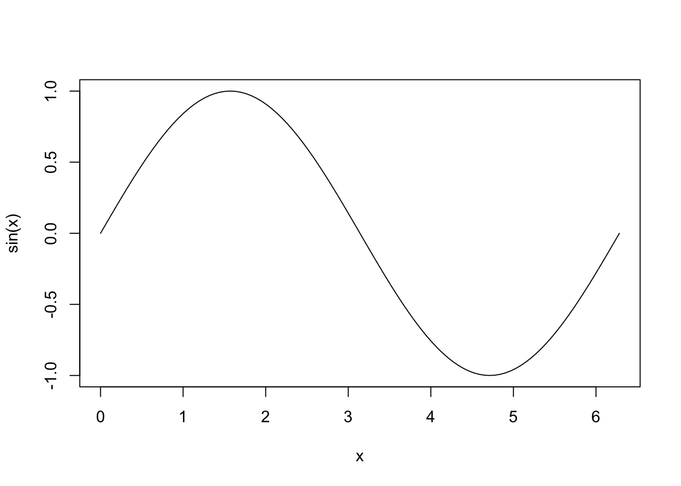
Then you can refer to in the in text by the label: See Figure 1.
Tips & gotchas
- Use
echo: falsevsinclude: falsecarefully.
- Labels must be unique (use
snake_caseorkebab-case).
eval: falseis helpful for showing code without running it.
- Consider
cache: truefor long computations.